はじめに
Rで、常微分方程式(ODE; Ordinary Differential Equation)の初期値問題を扱いたいと思います。
日本の生物系学部の講義では、あまり教えてくれないけども、
生化学・酵素化学の反応速度論は、ODEを一度解いて理解しないと
『酵素反応とは何か??』とかよく分からないまま、講義が終わってしまいます。
当時の私は、生化学で反応速度論をやっている人は「複雑な式を並べて反応モデル」を作り、なんて賢い研究者なのかと憧れを持っていました。
その後、実際には、反応速度論の基礎が分かれば、「誰でもできるやんけ」ということになりましたが。
当然ながら、複雑で解きにくいモデルとか何をモデル化するかとかいう課題もありますし、パソコンの計算性能がまだ脆弱だった時代にODEを解くのは大変な研究であったことは言うまでもありません。
仙人、ODEの課題は難しそうです。どうしましょう・・・
基本さえ分かれば、R言語の数値計算パッケージで簡単に解けてしまうものじゃよ。
それでは、本題に入っていきましょう。
解析解と数値解
数学的な問題の解は、「解析解」と「数値解」に大きく分けられて、両者は対義語ともなります。
解析解とは、数式を変形させて得られる解、つまりは解析式のこと
一方、数値解とは、実際に数値を代入して何らかのアルゴリズムを使用して、繰り返し計算して得られる解のこと 方程式に初期値を与えてみて、各項目の数値を計算することから、初期値問題の数値計算法
解析解については、記事の補足で触れていますが、
今回実際に、Rでやるのは数値解析の内容となります。
今回扱う反応式の事例
一次反応
逐次反応
可逆反応・不可逆反応
ミカエリス-メンテンの酵素反応モデル
変則的な反応モデル
について、モデル式、R言語での実行プログラムと、反応モデルを解いた結果のモーションチャートなどを解説していきます。
実行環境
以下が、実行環境です。
実行環境
macOS Big Sur (バージョン11.5.2)
MacBook Air (M1, 2020)
チップ Apple M1
メモリ 16GB
パッケージ準備
今回使用する、Rパッケージを準備します。
pack <- c ( "deSolve" , "ggplot2" , "animation" , "tidyverse" , "gganimate" , "plotly" , "htmltools" )
install.packages ( pack[ ! ( pack %in% unique ( rownames ( installed.packages ())))])
for ( n in 1 : length ( pack)){ eval ( parse ( text = paste0 ( "library(" , pack[ n], ")" ))) }; rm ( "n" , "pack" )
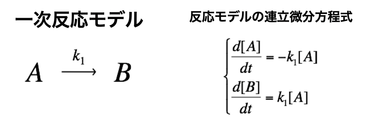
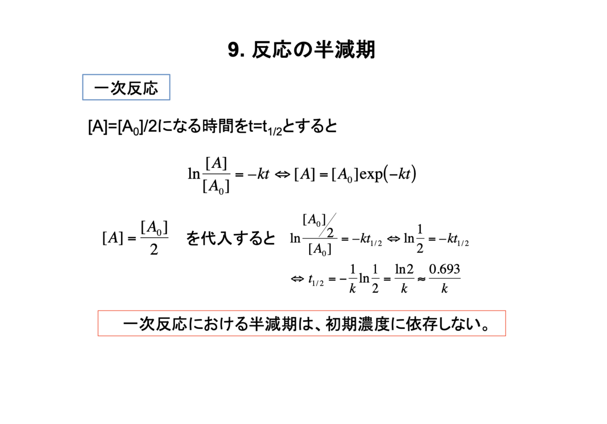
一次反応モデルの数値解析
一次反応モデル
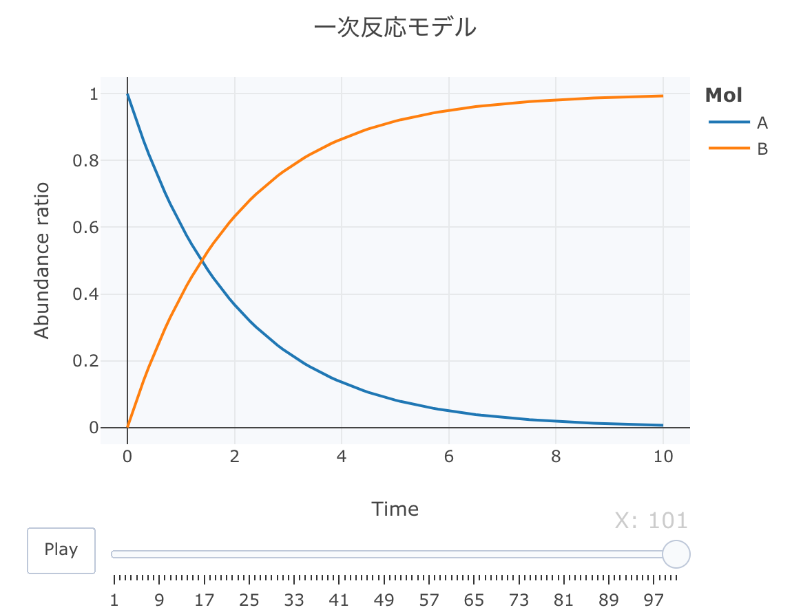
まずは、最もシンプルなモデルである、一次反応モデルについて数値計算してみます。
簡単にして、[A]が減少して、それに伴い、[B]が生成されるモデルです。
それでは、Rで、一次反応モデルの連立方程式を定義します。
Kinetics <- function ( t, c, parms){
k1 <- parms$ k1
r <- rep ( 0 , length ( c))
r[ 1 ] = - k1* c[ "A" ]
r[ 2 ] = k1* c[ "A" ]
return ( list ( r))}
次に、初期値を、[A]=1、[B]=0、k1=0.5に設定します。時間軸は0.1刻みにします。
cinitのベクトルは、各分子種の初期濃度です。[]は各濃度値であることを示します。
また、parmsには速度定数kをlist型で与えます。
速度定数kは、その値が大きくなると反応速度は速くなり、小さくなると遅くなります。
方程式の作り方としては、1つの矢印ごとに式を作ります。
左辺は状態ではなく、例えばd[A]/dtなので、時間tあたりの[A]の変化量ということになります。
また、重要なポイントとしては、矢印の元は変化量がマイナス(+)となり、矢印の先は変化量がプラス(+)となります。つまりは、速度定数kは必ずプラスの値としますので、[A]は-k[A]の速度で減少して、逆に[B]はk[A]の速度で増加するということになります。
cinit <- c ( A = 1 , B = 0 )
parms <- list ( k1 = 0.5 )
t <- seq ( 0 , 10 , by= 0.1 )
それでは、deSolve::ode関数で数値計算します。
Results <- deSolve:: ode ( y= cinit, times= t,
func= Kinetics, parms= parms, method= "lsoda" )
これで、計算完了です。 deSolve::odeの引数について解説します。
yは、ODEシステムの初期値 (状態)をベクトルで与えます。
ODEシステムにおける変数の現在の推定値です。
name属性がある場合、出力行列のラベルにその名前が使用されます。
timesは、出力の時間列で、timesの最初の値は初期時間にする必要があります。
funcには、時刻tにおけるODEシステム(モデル定義)の微分値を計算するR関数を与えます。
この関数では、y、times、parmsを定義します。
parmsでは、funcの関数に渡されるパラメータを定義します。
methodでは、使用する積分器を指定します。
rkMethodクラスのリスト、あるいは文字列で"lsoda"、"lsode"、"lsodes"、"lsodar"、"vode"、"daspk"、"euler"、"rk4"、"ode23"、"ode45"、"radau"、"bdf"、"bdf_d"、"adams"、"impAdams"あるいは"impAdams_d"、"iteration"のいずれかを指定します。
また、デフォルトで使用される積分器は、「lsoda」です。
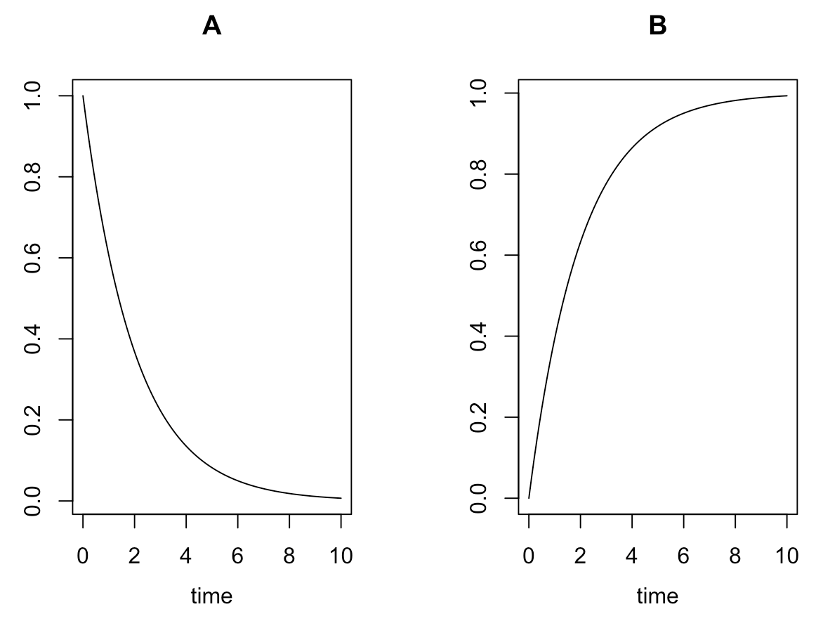
それでは、数値計算の結果について観ていきます。
head ( Results)
plot ( Results)
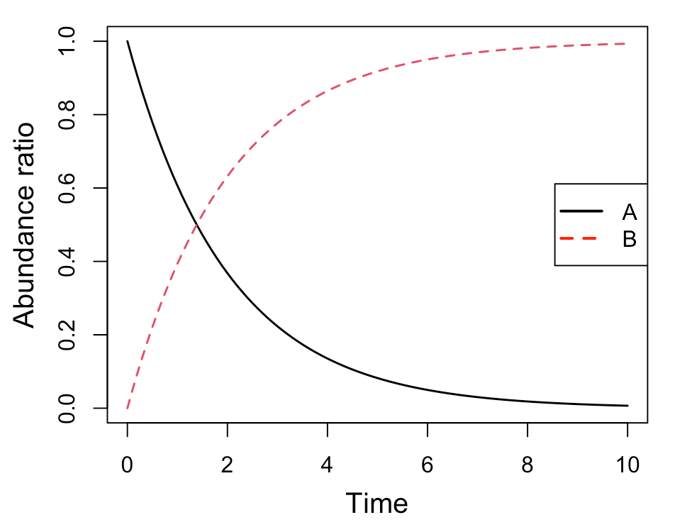
par ( mgp= c ( 2.5 , 1 , 0 ))
matplot ( Results[, 1 ], Results[, 2 : 3 ], type= "l" , lwd= 1.5 , xlab= "Time" , ylab= "Abundance ratio" , cex.lab= 1.25 )
legend ( "right" , legend= c ( "A" , "B" ), col= c ( "black" , "red" ), pch= "" , lty= c ( 1 , 2 ), lwd= 2 , cex= 1 )
簡易プロット(1)
簡易プロット(2)
[A]が一次的に下がって、それに対して、[B]が一次的に増加していくのが分かると思います。
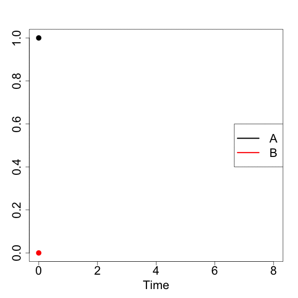
animationパッケージでモーションチャート作成
次に、animationパッケージでアニメーション図を作成してみます。
matplot関数とsaveGIF関数を組み合わせます。
animation:: saveGIF ({ for ( n in 1 : nrow ( Results)){
matplot ( Results[, 1 ][ 1 : n], data.frame ( Results[, 2 ][ 1 : n], Results[, 3 ][ 1 : n]), type= "l" , lty= 1 , lwd= 3 , col= c ( "black" , "red" ), xlab= "Time" , ylab= "" , xlim= c ( 0 , 8 ), ylim= c ( 0 , 1 ), cex.lab= 2 , cex.axis= 2 )
legend ( "right" , legend= c ( "A" , "B" ), col= c ( "black" , "red" ), pch= "" , lty= 1 , lwd= 3 , cex= 2 )
matpoints ( Results[, 1 ][ n], Results[, 2 ][ n], pch= 16 , col= "black" , cex= 2 )
matpoints ( Results[, 1 ][ n], Results[, 3 ][ n], pch= 16 , col= "red" , cex= 2 )
}}, movie.name = "01_motion.gif" , interval = 0.1 , nmax = nrow ( Results), ani.width = 600 , ani.height = 600 )
animationでのgifアニメーション
ggplot2でモーションチャート作成
モダンなRプログラミングということで、ggplotでモーションチャートを作成してみます。
Dat <- data.frame ( Results)
Dat$ frame <- as.numeric ( rownames ( Dat))
Dat0 <- tidyr:: gather ( Dat, key= Mol, value= val, A, B, - c ( frame, time))
head ( Dat0)
a <- nrow ( Dat0) / length ( unique ( Dat0$ Mol))
b <- max ( Dat0$ time)
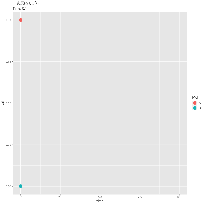
p <- ggplot ( Dat0, aes ( x = time, y = val, color = Mol)) +
geom_point ( size = 5 , show.legend = TRUE ) +
geom_path ( size = 1 , alpha = 0.5 , show.legend = FALSE ) +
gganimate:: transition_reveal ( along = frame) +
labs ( title = "一次反応モデル" , subtitle = paste0 ( "Time: {round(frame_along*b/a, 2)}" )) +
theme_gray ( base_family = "HiraKakuPro-W3" )
gganimate:: animate ( p, fps = 5 , duration = 20 , width = 700 , height = 700 ,
renderer = gifski_renderer ( "01_ggplot_motion.gif" ))
ggplot2でのgifアニメーション
plot_lyでモーションチャート作成
最近マイブームのplot_lyでモーションチャートを作成します。
今回は、こっちをメインで使用します。
accumulate_by <- function ( dat, var) {
var <- lazyeval:: f_eval ( var, dat)
lvls <- plotly::: getLevels ( var)
dats <- lapply ( seq_along ( lvls), function ( x) {
cbind ( dat[ var %in% lvls[ seq ( 1 , x)], ], X = lvls[[ x]])
})
dplyr:: bind_rows ( dats)
}
Dat1 <- Dat0 %>% accumulate_by ( ~ frame)
head ( Dat1)
fig <- plotly:: plot_ly ( Dat1,
x = ~ time,
y = ~ val,
split = ~ Mol,
frame = ~ X,
type = 'scatter' ,
mode = 'lines' ) %>%
layout ( title = '一次反応モデル' ,
plot_bgcolor = "#e5ecf650" ,
xaxis = list ( title = 'Time' ),
yaxis = list ( title = 'Abundance ratio' ),
legend = list ( title= list ( text= '<b>Mol</b>' )),
margin = list ( l = 80 , r = 80 , b = 80 , t = 60 , pad = 0 )) %>%
animation_opts ( frame = a, transition = 0 , redraw = FALSE )
fig
fig %>% htmltools:: save_html ( file= "01_plotly_motion.html" )
https://kumes.github.io/Blog/R_ODE/01_plotly_motion.html
htmlリンクをクリックすると、実際のモーションチャートが見えます。
逐次反応モデルの数値解析
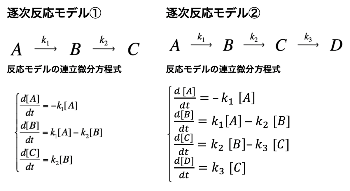
逐次反応モデル
次に、3つ以上の分子種が連続的に反応することを想定した、逐次反応モデルについて数値計算を行なってみます。
モデルとしては、3つの分子種(A, B, C)あるいは4つの分子種(A, B, C, D)を想定します。
それでは、Rで逐次反応モデルの連立方程式を定義します。
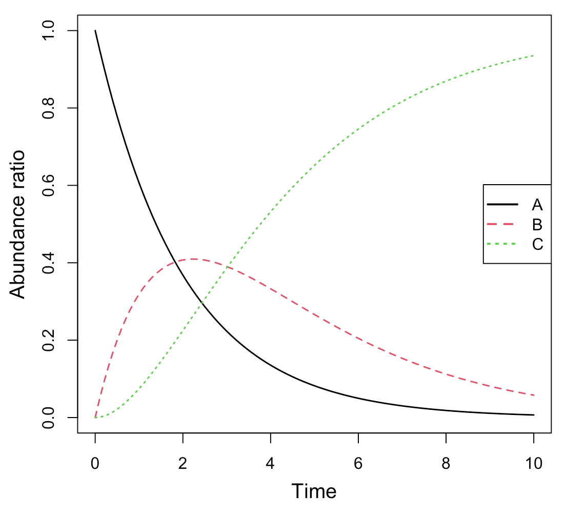
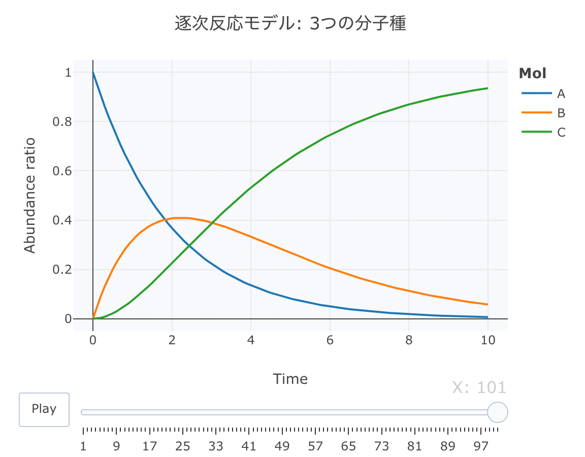
逐次反応モデル: 3つの分子種(A, B, C)
これは、AからB、BからCが逐次的に生成されるモデルです。
Kinetics <- function ( t, c, parms){
k1 <- parms$ k1
k2 <- parms$ k2
r <- rep ( 0 , length ( c))
r[ 1 ] = - k1* c[ "A" ]
r[ 2 ] = k1* c[ "A" ] - k2* c[ "B" ]
r[ 3 ] = k2* c[ "B" ]
return ( list ( r))}
次に、初期値を、[A]=1、[B]=0、[C]=0、k1=0.5、k2=0.4に設定します。時間軸は0.1刻みにします。
cinit <- c ( A = 1 , B = 0 , C = 0 )
parms <- list ( k1 = 0.5 , k2 = 0.4 )
t <- seq ( 0 , 10 , by= 0.1 )
それでは、deSolve::ode関数で数値計算します。
Results <- deSolve:: ode ( y= cinit, times= t,
func= Kinetics, parms= parms, method= "lsoda" )
par ( mgp= c ( 2.5 , 1 , 0 ))
matplot ( Results[, 1 ], Results[, 2 : ncol ( Results)], type= "l" , lwd= 1.5 , xlab= "Time" , ylab= "Abundance ratio" , cex.lab= 1.25 )
legend ( "right" , legend= colnames ( Results)[ 2 : ncol ( Results)],
col= 1 :( ncol ( Results) - 1 ), pch= "" , lty= 1 :( ncol ( Results) - 1 ), lwd= 2 , cex= 1 )
簡易プロット
続いて、plot_lyでモーションチャートを作成します。
source ( "https://gist.githubusercontent.com/kumeS/c516415c9ab4d25a2a6ae078e4d87837/raw/5be7e171ae9ce03c6110fa6a1ccb20d69aa45412/accumulate_by.R" )
Dat <- data.frame ( Results)
Dat$ frame <- as.numeric ( rownames ( Dat))
Dat0 <- tidyr:: gather ( Dat, key= Mol, value= val, A, B, C, - c ( frame, time))
Dat1 <- Dat0 %>% accumulate_by ( ~ frame)
a <- nrow ( Dat0) / length ( unique ( Dat0$ Mol))
fig <- plotly:: plot_ly ( Dat1,
x = ~ time,
y = ~ val,
split = ~ Mol,
frame = ~ X,
type = 'scatter' ,
mode = 'lines' ) %>%
layout ( title = '逐次反応モデル: 3つの分子種' ,
plot_bgcolor = "#e5ecf650" ,
xaxis = list ( title = 'Time' ),
yaxis = list ( title = 'Abundance ratio' ),
legend = list ( title= list ( text= '<b>Mol</b>' )),
margin = list ( l = 80 , r = 80 , b = 80 , t = 60 , pad = 0 )) %>%
animation_opts ( frame = a,
transition = 0 ,
redraw = FALSE )
fig
fig %>% htmltools:: save_html ( file= "02_plotly_motion_3.html" )
https://kumes.github.io/Blog/R_ODE/02_plotly_motion_3.html
htmlリンクをクリックすると、実際のモーションチャートが見えます。
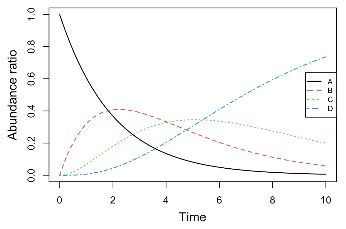
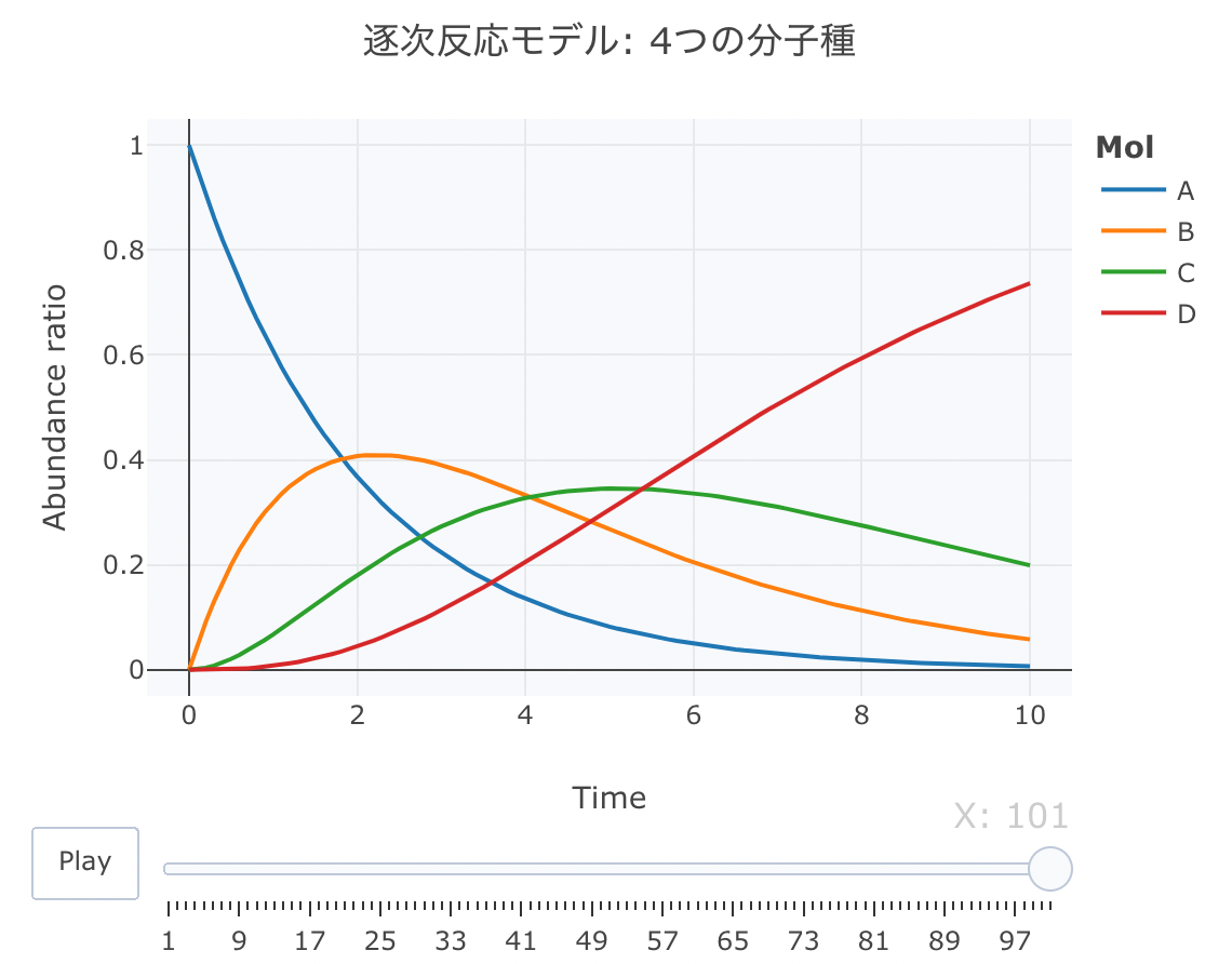
逐次反応モデル: 4つの分子種(A, B, C, D)
これは、AからB、BからC、CからDが逐次的に生成されるモデルです。
Kinetics <- function ( t, c, parms){
k1 <- parms$ k1
k2 <- parms$ k2
k3 <- parms$ k3
r <- rep ( 0 , length ( c))
r[ 1 ] = - k1* c[ "A" ]
r[ 2 ] = k1* c[ "A" ] - k2* c[ "B" ]
r[ 3 ] = k2* c[ "B" ] - k3* c[ "C" ]
r[ 4 ] = k3* c[ "C" ]
return ( list ( r))}
次に、初期値を、[A]=1、[B]=0、[C]=0、[D]=0、k1=0.5、k2=0.4、k3=0.3に設定します。時間軸は0.1刻みにします。
cinit <- c ( A = 1 , B = 0 , C = 0 , D = 0 )
parms <- list ( k1 = 0.5 , k2 = 0.4 , k3 = 0.3 )
t <- seq ( 0 , 10 , by= 0.1 )
それでは、deSolve::ode関数で数値計算します。
Results <- deSolve:: ode ( y= cinit, times= t,
func= Kinetics, parms= parms, method= "lsoda" )
par ( mgp= c ( 2.5 , 1 , 0 ))
matplot ( Results[, 1 ], Results[, 2 : ncol ( Results)], type= "l" , lwd= 1.5 , xlab= "Time" , ylab= "Abundance ratio" , cex.lab= 1.25 )
legend ( "right" , legend= colnames ( Results)[ 2 : ncol ( Results)],
col= 1 :( ncol ( Results) - 1 ), pch= "" , lty= 1 :( ncol ( Results) - 1 ), lwd= 2 , cex= 0.75 )
簡易プロット
続いて、plot_lyでモーションチャートを作成します。
source ( "https://gist.githubusercontent.com/kumeS/c516415c9ab4d25a2a6ae078e4d87837/raw/5be7e171ae9ce03c6110fa6a1ccb20d69aa45412/accumulate_by.R" )
Dat <- data.frame ( Results)
Dat$ frame <- as.numeric ( rownames ( Dat))
Dat0 <- tidyr:: gather ( Dat, key= Mol, value= val, A, B, C, D, - c ( frame, time))
Dat1 <- Dat0 %>% accumulate_by ( ~ frame)
a <- nrow ( Dat0) / length ( unique ( Dat0$ Mol))
fig <- plotly:: plot_ly ( Dat1,
x = ~ time,
y = ~ val,
split = ~ Mol,
frame = ~ X,
type = 'scatter' ,
mode = 'lines' ) %>%
layout ( title = '逐次反応モデル: 4つの分子種' ,
plot_bgcolor = "#e5ecf650" ,
xaxis = list ( title = 'Time' ),
yaxis = list ( title = 'Abundance ratio' ),
legend = list ( title= list ( text= '<b>Mol</b>' )),
margin = list ( l = 80 , r = 80 , b = 80 , t = 60 , pad = 0 )) %>%
animation_opts ( frame = a,
transition = 0 ,
redraw = FALSE )
fig
fig %>% htmltools:: save_html ( file= "02_plotly_motion_4.html" )
https://kumes.github.io/Blog/R_ODE/02_plotly_motion_4.html
htmlリンクをクリックすると、実際のモーションチャートが見えます。
平衡反応モデルの数値解析
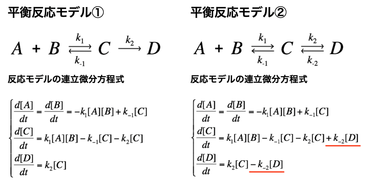
平衡反応モデル
続いて、平衡反応モデルについて数値計算を行なってみます。
モデルとしては、後半の反応(k2)が可逆反応の場合と不可逆反応の場合とを想定します。
それでは、まずは、不可逆反応の平衡反応モデルの連立方程式を定義します。
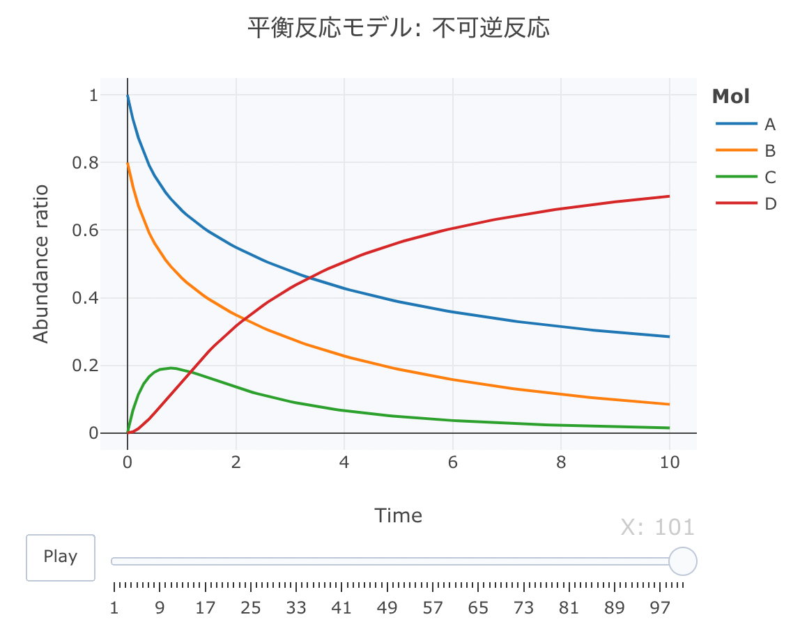
平衡反応モデル① 不可逆反応
A、BとCの間の反応が可逆反応で、CからDへの反応が不可逆反応であるモデルを定義します。
Kinetics <- function ( t, c, parms){
k1 <- parms$ k1
k2 <- parms$ k2
k3 <- parms$ k3
r <- rep ( 0 , length ( c))
r[ 1 ] = - k1* c[ "A" ] * c[ "B" ] + k2* c[ "C" ]
r[ 2 ] = - k1* c[ "A" ] * c[ "B" ] + k2* c[ "C" ]
r[ 3 ] = k1* c[ "A" ] * c[ "B" ] - k2* c[ "C" ] - k3* c[ "C" ]
r[ 4 ] = k3* c[ "C" ]
return ( list ( r))}
次に、初期値を、[A]=1、[B]=0.8、[C]=0、[D]=0、k1=1、k2=0.8、k3=1に設定します。時間軸は0.1刻みにします。
cinit <- c ( A = 1 , B = 0.8 , C = 0 , D = 0 )
parms <- list ( k1 = 1 , k2 = 0.8 , k3 = 1 )
t <- seq ( 0 , 10 , by= 0.1 )
それでは、deSolve::ode関数で数値計算します。
Results <- deSolve:: ode ( y= cinit, times= t,
func= Kinetics, parms= parms, method= "lsoda" )
source ( "https://gist.githubusercontent.com/kumeS/c516415c9ab4d25a2a6ae078e4d87837/raw/5be7e171ae9ce03c6110fa6a1ccb20d69aa45412/accumulate_by.R" )
Dat <- data.frame ( Results)
Dat$ frame <- as.numeric ( rownames ( Dat))
Dat0 <- tidyr:: gather ( Dat, key= Mol, value= val, A, B, C, D, - c ( frame, time))
Dat1 <- Dat0 %>% accumulate_by ( ~ frame)
a <- nrow ( Dat0) / length ( unique ( Dat0$ Mol))
fig <- plotly:: plot_ly ( Dat1,
x = ~ time,
y = ~ val,
split = ~ Mol,
frame = ~ X,
type = 'scatter' ,
mode = 'lines' ) %>%
layout ( title = '平衡反応モデル: 不可逆反応' ,
plot_bgcolor = "#e5ecf650" ,
xaxis = list ( title = 'Time' ),
yaxis = list ( title = 'Abundance ratio' ),
legend = list ( title= list ( text= '<b>Mol</b>' )),
margin = list ( l = 80 , r = 80 , b = 80 , t = 60 , pad = 0 )) %>%
animation_opts ( frame = a, transition = 0 , redraw = FALSE )
fig
fig %>% htmltools:: save_html ( file= "03_plotly_motion_1.html" )
https://kumes.github.io/Blog/R_ODE/03_plotly_motion_1.html
htmlリンクをクリックすると、実際のモーションチャートが見えます。
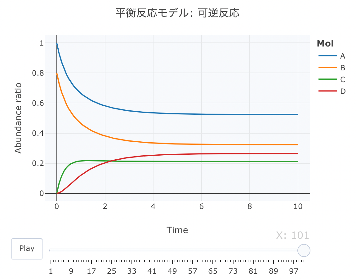
平衡反応モデル② 可逆反応
次に、可逆反応の平衡反応モデルの連立方程式を定義します。
A、BとCの間の反応が可逆反応で、CからDへの反応も可逆な反応モデルを定義します。
Kinetics <- function ( t, c, parms){
k1 <- parms$ k1
k2 <- parms$ k2
k3 <- parms$ k3
k4 <- parms$ k4
r <- rep ( 0 , length ( c))
r[ 1 ] = - k1* c[ "A" ] * c[ "B" ] + k2* c[ "C" ]
r[ 2 ] = - k1* c[ "A" ] * c[ "B" ] + k2* c[ "C" ]
r[ 3 ] = k1* c[ "A" ] * c[ "B" ] - k2* c[ "C" ] - k3* c[ "C" ] + k4* c[ "D" ]
r[ 4 ] = k3* c[ "C" ] - k4* c[ "D" ]
return ( list ( r))}
次に、初期値を、[A]=1、[B]=0.8、[C]=0、[D]=0、k1=1、k2=0.8、k3=1、k4=0.8に設定します。時間軸は0.1刻みにします。
cinit <- c ( A = 1 , B = 0.8 , C = 0 , D = 0 )
parms <- list ( k1 = 1 , k2 = 0.8 , k3 = 1 , k4 = 0.8 )
t <- seq ( 0 , 10 , by= 0.1 )
それでは、deSolve::ode関数で数値計算します。
Results <- deSolve:: ode ( y= cinit, times= t,
func= Kinetics, parms= parms, method= "lsoda" )
source ( "https://gist.githubusercontent.com/kumeS/c516415c9ab4d25a2a6ae078e4d87837/raw/5be7e171ae9ce03c6110fa6a1ccb20d69aa45412/accumulate_by.R" )
Dat <- data.frame ( Results)
Dat$ frame <- as.numeric ( rownames ( Dat))
Dat0 <- tidyr:: gather ( Dat, key= Mol, value= val, A, B, C, D, - c ( frame, time))
Dat1 <- Dat0 %>% accumulate_by ( ~ frame)
a <- nrow ( Dat0) / length ( unique ( Dat0$ Mol))
fig <- plotly:: plot_ly ( Dat1,
x = ~ time,
y = ~ val,
split = ~ Mol,
frame = ~ X,
type = 'scatter' ,
mode = 'lines' ) %>%
layout ( title = '平衡反応モデル: 可逆反応' ,
plot_bgcolor = "#e5ecf650" ,
xaxis = list ( title = 'Time' ),
yaxis = list ( title = 'Abundance ratio' ),
legend = list ( title= list ( text= '<b>Mol</b>' )),
margin = list ( l = 80 , r = 80 , b = 80 , t = 60 , pad = 0 )) %>%
animation_opts ( frame = a, transition = 0 , redraw = FALSE )
fig
fig %>% htmltools:: save_html ( file= "03_plotly_motion_2.html" )
https://kumes.github.io/Blog/R_ODE/03_plotly_motion_2.html
htmlリンクをクリックすると、実際のモーションチャートが見えます。
酵素化学への常微分方程式の応用
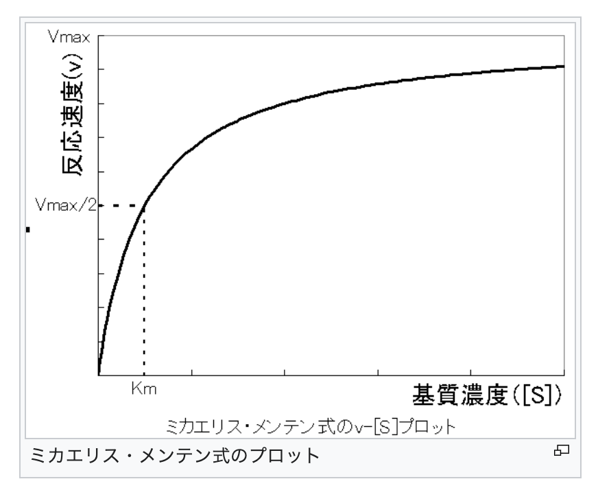
ミカエリス・メンテン式のプロット
次は、酵素化学分野でとても有名な、ミカエリス・メンテン速度論を取り扱います。
この式は、1913年にドイツの生化学者Leonor Michaelisとカナダの生化学者Maud L. Mentenによって提案されました。
通常、迅速平衡法あるいは定常状態法を仮定して、このミカエリス・メンテン式は導かれるが、ここでは、下記の「酵素反応 不可逆反応モデル」と「酵素反応 可逆反応モデル」という数値解析の課題として扱います。
酵素反応モデル
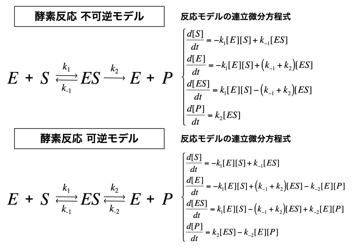
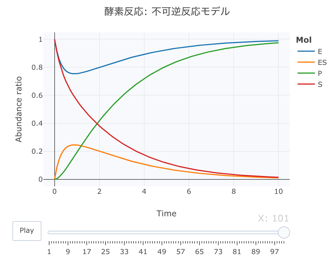
酵素反応 不可逆反応モデルの数値解析
それでは、酵素反応の不可逆反応モデルの連立方程式を定義します。
このモデルは、P(プロダクト)の生成が一方方向のモデルです。
Kinetics <- function ( t, c, parms){
k1 <- parms$ k1
k2 <- parms$ k2
k3 <- parms$ k3
r <- rep ( 0 , length ( c))
r[ 1 ] = - k1* c[ "E" ] * c[ "S" ] + k2* c[ "ES" ]
r[ 2 ] = - k1* c[ "E" ] * c[ "S" ] + ( k2+ k3) * c[ "ES" ]
r[ 3 ] = k1* c[ "E" ] * c[ "S" ] - ( k2+ k3) * c[ "ES" ]
r[ 4 ] = k3* c[ "ES" ]
return ( list ( r))}
次に、初期値を、[S]=1、[E]=1、[ES]=0、[P]=0、k1=1、k2=0.8、k3=1に設定します。時間軸は0.1刻みにします。
cinit <- c ( S = 1 , E = 1 , ES = 0 , P = 0 )
parms <- list ( k1 = 1 , k2 = 0.8 , k3 = 1 )
t <- seq ( 0 , 10 , by= 0.1 )
それでは、deSolve::ode関数で数値計算します。
Results <- deSolve:: ode ( y= cinit, times= t,
func= Kinetics, parms= parms, method= "lsoda" )
source ( "https://gist.githubusercontent.com/kumeS/c516415c9ab4d25a2a6ae078e4d87837/raw/5be7e171ae9ce03c6110fa6a1ccb20d69aa45412/accumulate_by.R" )
Dat <- data.frame ( Results)
Dat$ frame <- as.numeric ( rownames ( Dat))
Dat0 <- tidyr:: gather ( Dat, key= Mol, value= val, S, E, ES, P, - c ( frame, time))
Dat1 <- Dat0 %>% accumulate_by ( ~ frame)
a <- nrow ( Dat0) / length ( unique ( Dat0$ Mol))
fig <- plotly:: plot_ly ( Dat1,
x = ~ time,
y = ~ val,
split = ~ Mol,
frame = ~ X,
type = 'scatter' ,
mode = 'lines' ) %>%
layout ( title = '酵素反応: 不可逆反応モデル' ,
plot_bgcolor = "#e5ecf650" ,
xaxis = list ( title = 'Time' ),
yaxis = list ( title = 'Abundance ratio' ),
legend = list ( title= list ( text= '<b>Mol</b>' )),
margin = list ( l = 80 , r = 80 , b = 80 , t = 60 , pad = 0 )) %>%
animation_opts ( frame = a, transition = 0 , redraw = FALSE )
fig
fig %>% htmltools:: save_html ( file= "04_plotly_motion_1.html" )
https://kumes.github.io/Blog/R_ODE/04_plotly_motion_1.html
htmlリンクをクリックすると、実際のモーションチャートが見えます。
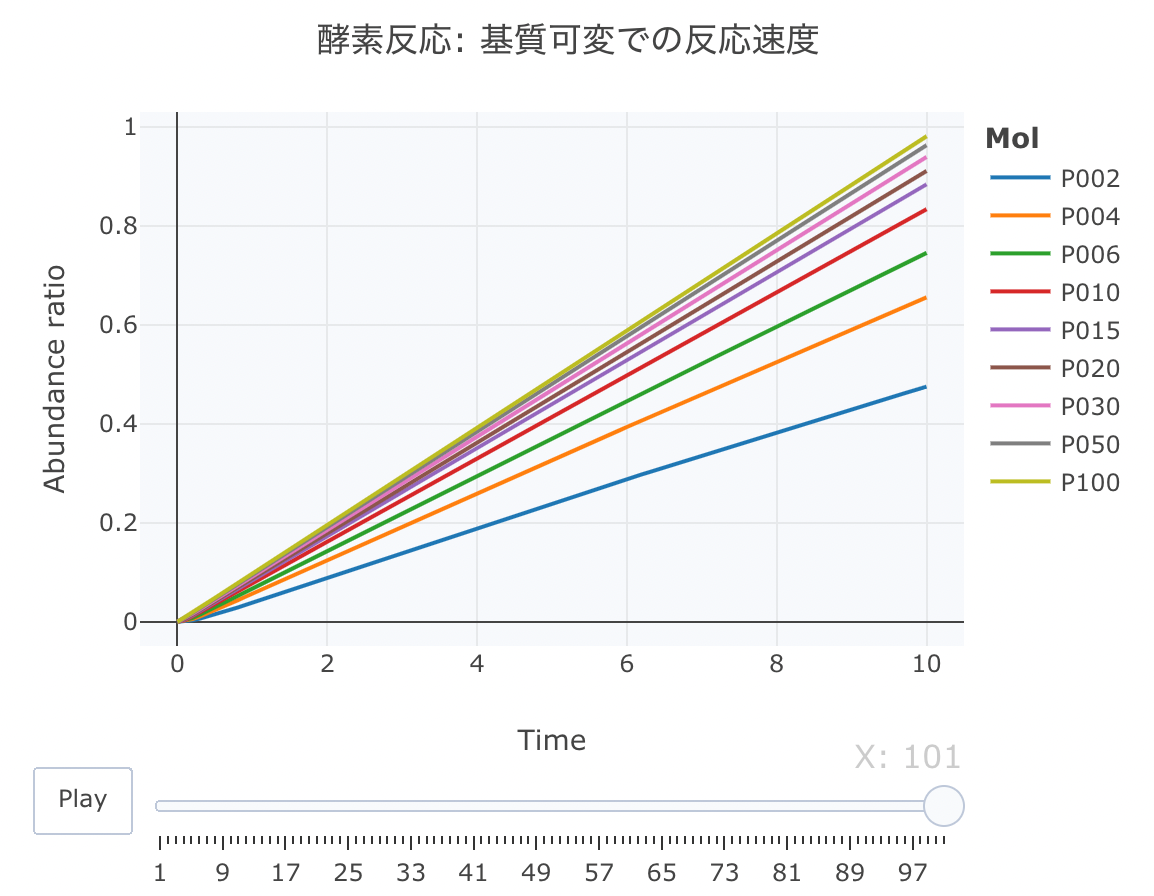
基質過剰・酵素低量の条件下で 不可逆反応モデルの数値解析を行うと・・・
連立方程式は上記と同じで、基質濃度([S])を変えて、反応速度をプロットしてみます。
初期値を[E]=0.1、[ES]=0、[P]=0、k1=1、k2=0.8、k3=1に設定します。時間軸は0.1刻みにします。
[S]は、2、4、6、10、15、20...という感じで複数条件を設定します。
t <- seq ( 0 , 10 , by= 0.1 )
cinit <- c ( S = 2 , E = 0.1 , ES = 0 , P = 0 )
parms <- list ( k1 = 1 , k2 = 0.8 , k3 = 1 )
Results1 <- deSolve:: ode ( y= cinit, times= t,
func= Kinetics, parms= parms, method= "lsoda" )
cinit <- c ( S = 4 , E = 0.1 , ES = 0 , P = 0 )
parms <- list ( k1 = 1 , k2 = 0.8 , k3 = 1 )
Results2 <- deSolve:: ode ( y= cinit, times= t,
func= Kinetics, parms= parms, method= "lsoda" )
cinit <- c ( S = 6 , E = 0.1 , ES = 0 , P = 0 )
parms <- list ( k1 = 1 , k2 = 0.8 , k3 = 1 )
Results3 <- deSolve:: ode ( y= cinit, times= t,
func= Kinetics, parms= parms, method= "lsoda" )
cinit <- c ( S = 10 , E = 0.1 , ES = 0 , P = 0 )
parms <- list ( k1 = 1 , k2 = 0.8 , k3 = 1 )
Results4 <- deSolve:: ode ( y= cinit, times= t,
func= Kinetics, parms= parms, method= "lsoda" )
cinit <- c ( S = 15 , E = 0.1 , ES = 0 , P = 0 )
parms <- list ( k1 = 1 , k2 = 0.8 , k3 = 1 )
Results5 <- deSolve:: ode ( y= cinit, times= t,
func= Kinetics, parms= parms, method= "lsoda" )
cinit <- c ( S = 20 , E = 0.1 , ES = 0 , P = 0 )
parms <- list ( k1 = 1 , k2 = 0.8 , k3 = 1 )
Results6 <- deSolve:: ode ( y= cinit, times= t,
func= Kinetics, parms= parms, method= "lsoda" )
cinit <- c ( S = 30 , E = 0.1 , ES = 0 , P = 0 )
parms <- list ( k1 = 1 , k2 = 0.8 , k3 = 1 )
Results7 <- deSolve:: ode ( y= cinit, times= t,
func= Kinetics, parms= parms, method= "lsoda" )
cinit <- c ( S = 50 , E = 0.1 , ES = 0 , P = 0 )
parms <- list ( k1 = 1 , k2 = 0.8 , k3 = 1 )
Results8 <- deSolve:: ode ( y= cinit, times= t,
func= Kinetics, parms= parms, method= "lsoda" )
cinit <- c ( S = 100 , E = 0.1 , ES = 0 , P = 0 )
parms <- list ( k1 = 1 , k2 = 0.8 , k3 = 1 )
Results9 <- deSolve:: ode ( y= cinit, times= t,
func= Kinetics, parms= parms, method= "lsoda" )
Results.c <- data.frame ( time= Results1[, c ( "time" )],
P002= Results1[, c ( "P" )],
P004= Results2[, c ( "P" )],
P006= Results3[, c ( "P" )],
P010= Results4[, c ( "P" )],
P015= Results5[, c ( "P" )],
P020= Results6[, c ( "P" )],
P030= Results7[, c ( "P" )],
P050= Results8[, c ( "P" )],
P100= Results9[, c ( "P" )])
それでは、deSolve::ode関数で数値計算します。
source ( "https://gist.githubusercontent.com/kumeS/c516415c9ab4d25a2a6ae078e4d87837/raw/5be7e171ae9ce03c6110fa6a1ccb20d69aa45412/accumulate_by.R" )
Dat <- data.frame ( Results.c)
Dat$ frame <- as.numeric ( rownames ( Dat))
Dat0 <- tidyr:: gather ( Dat, key= Mol,
value= val, P002, P004, P006, P010, P015, P020, P030, P050, P100, - c ( frame, time))
Dat1 <- Dat0 %>% accumulate_by ( ~ frame)
a <- nrow ( Dat0) / length ( unique ( Dat0$ Mol))
fig <- plotly:: plot_ly ( Dat1,
x = ~ time,
y = ~ val,
split = ~ Mol,
frame = ~ X,
type = 'scatter' ,
mode = 'lines' ) %>%
layout ( title = '酵素反応: 基質可変での反応速度' ,
plot_bgcolor = "#e5ecf650" ,
xaxis = list ( title = 'Time' ),
yaxis = list ( title = 'Abundance ratio' ),
legend = list ( title= list ( text= '<b>Mol</b>' )),
margin = list ( l = 80 , r = 80 , b = 80 , t = 60 , pad = 0 )) %>%
animation_opts ( frame = a, transition = 0 , redraw = FALSE )
fig
fig %>% htmltools:: save_html ( file= "04_plotly_motion_kahen.html" )
https://kumes.github.io/Blog/R_ODE/04_plotly_motion_kahen.html
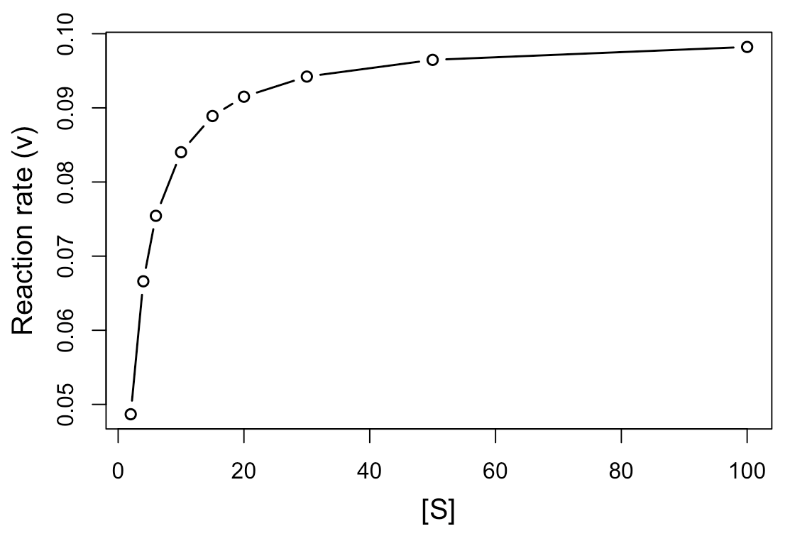
次に、反応の初速を計算して、基質濃度[S]に対してプロットしてみます。
head ( Results.c)
res <- data.frame ( S= c ( 2 , 4 , 6 , 10 , 15 , 20 , 30 , 50 , 100 ),
V= NA )
res$ V[ 1 ] <- lm ( P002 ~ time, data = Results.c)$ coefficients[ 2 ]
res$ V[ 2 ] <- lm ( P004 ~ time, data = Results.c)$ coefficients[ 2 ]
res$ V[ 3 ] <- lm ( P006 ~ time, data = Results.c)$ coefficients[ 2 ]
res$ V[ 4 ] <- lm ( P010 ~ time, data = Results.c)$ coefficients[ 2 ]
res$ V[ 5 ] <- lm ( P015 ~ time, data = Results.c)$ coefficients[ 2 ]
res$ V[ 6 ] <- lm ( P020 ~ time, data = Results.c)$ coefficients[ 2 ]
res$ V[ 7 ] <- lm ( P030 ~ time, data = Results.c)$ coefficients[ 2 ]
res$ V[ 8 ] <- lm ( P050 ~ time, data = Results.c)$ coefficients[ 2 ]
res$ V[ 9 ] <- lm ( P100 ~ time, data = Results.c)$ coefficients[ 2 ]
par ( mgp= c ( 2.5 , 1 , 0 ))
matplot ( res$ S, res$ V, type= "b" , pch= 21 , lwd= 1.5 , xlab= "[S]" , ylab= "Reaction rate (v)" , cex.lab= 1.25 )
基質濃度と反応速度のプロット
基質濃度[S]に対して、反応速度(v、ここでは反応の初速となる)をプロットしますと、上記のような飽和曲線が得られます。
Vmaxは基質濃度が無限大のときの反応速度となります。
だいたい、0.1くらいに収束すると思われます。
また、Kmはミカエリス・メンテン定数と言い、v = Vmax /2(最大速度の半分の速度)を与える基質濃度として表されます。
ja.wikipedia.org
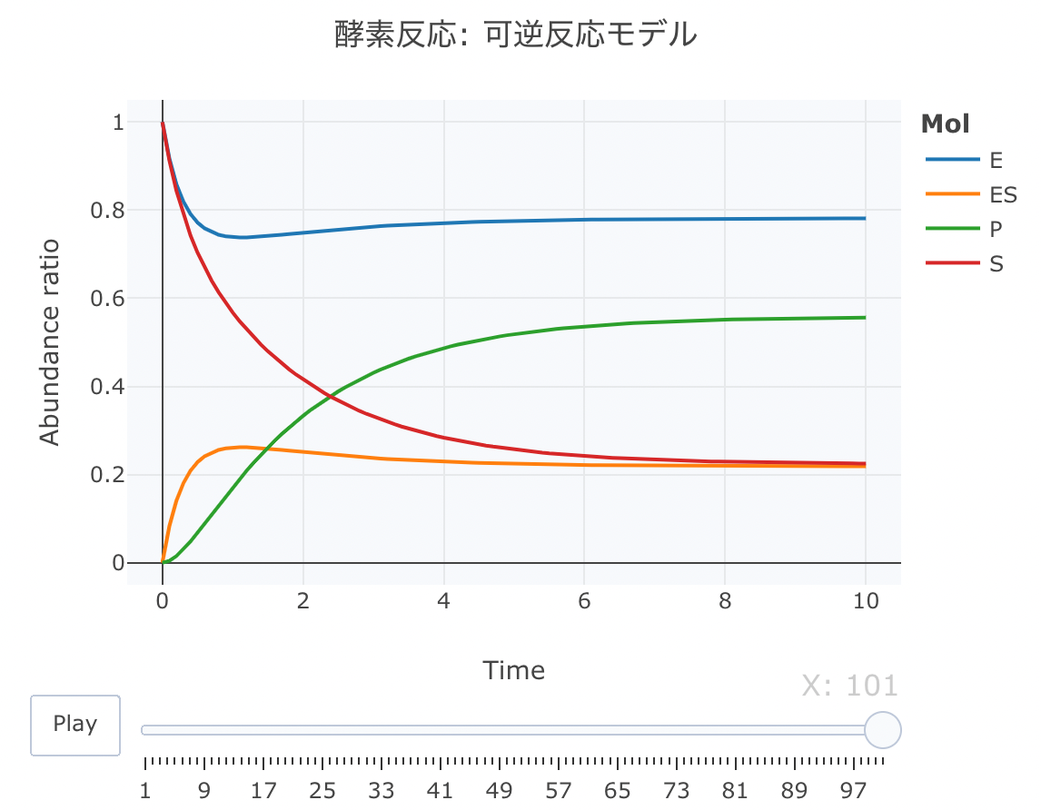
酵素反応 可逆反応モデルの数値解析
続いて、酵素反応の可逆反応モデルをやってみます
このモデルでは、P(プロダクト)の生成が可逆方向のモデルです。
それでは、その連立方程式を定義します。
Kinetics <- function ( t, c, parms){
k1 <- parms$ k1
k2 <- parms$ k2
k3 <- parms$ k3
k4 <- parms$ k4
r <- rep ( 0 , length ( c))
r[ 1 ] = - k1* c[ "E" ] * c[ "S" ] + k2* c[ "ES" ]
r[ 2 ] = - k1* c[ "E" ] * c[ "S" ] + ( k2+ k3) * c[ "ES" ] - k4* c[ "E" ] * c[ "P" ]
r[ 3 ] = k1* c[ "E" ] * c[ "S" ] - ( k2+ k3) * c[ "ES" ] + k4* c[ "E" ] * c[ "P" ]
r[ 4 ] = k3* c[ "ES" ] - k4* c[ "E" ] * c[ "P" ]
return ( list ( r))}
次に、初期値を、[S]=1、[E]=1、[ES]=0、[P]=0、k1=1、k2=0.8、k3=1、k3=4に設定します。時間軸は0.1刻みにします。
cinit <- c ( S = 1 , E = 1 , ES = 0 , P = 0 )
parms <- list ( k1 = 1 , k2 = 0.8 , k3 = 1 , k4 = 0.5 )
t <- seq ( 0 , 10 , by= 0.1 )
それでは、deSolve::ode関数で数値計算します。
Results <- deSolve:: ode ( y= cinit, times= t,
func= Kinetics, parms= parms, method= "lsoda" )
source ( "https://gist.githubusercontent.com/kumeS/c516415c9ab4d25a2a6ae078e4d87837/raw/5be7e171ae9ce03c6110fa6a1ccb20d69aa45412/accumulate_by.R" )
Dat <- data.frame ( Results)
Dat$ frame <- as.numeric ( rownames ( Dat))
Dat0 <- tidyr:: gather ( Dat, key= Mol, value= val, S, E, ES, P, - c ( frame, time))
Dat1 <- Dat0 %>% accumulate_by ( ~ frame)
a <- nrow ( Dat0) / length ( unique ( Dat0$ Mol))
fig <- plotly:: plot_ly ( Dat1,
x = ~ time,
y = ~ val,
split = ~ Mol,
frame = ~ X,
type = 'scatter' ,
mode = 'lines' ) %>%
layout ( title = '酵素反応: 可逆反応モデル' ,
plot_bgcolor = "#e5ecf650" ,
xaxis = list ( title = 'Time' ),
yaxis = list ( title = 'Abundance ratio' ),
legend = list ( title= list ( text= '<b>Mol</b>' )),
margin = list ( l = 80 , r = 80 , b = 80 , t = 60 , pad = 0 )) %>%
animation_opts ( frame = a, transition = 0 , redraw = FALSE )
fig
fig %>% htmltools:: save_html ( file= "04_plotly_motion_2.html" )
https://kumes.github.io/Blog/R_ODE/04_plotly_motion_2.html
htmlリンクをクリックすると、実際のモーションチャートが見えます。
変則的な反応システムでの数値計算
ここからは、少し変則な反応系について連立方程式を作成してみます。
四角型、逆コ型、菱形モデルと名付けています。
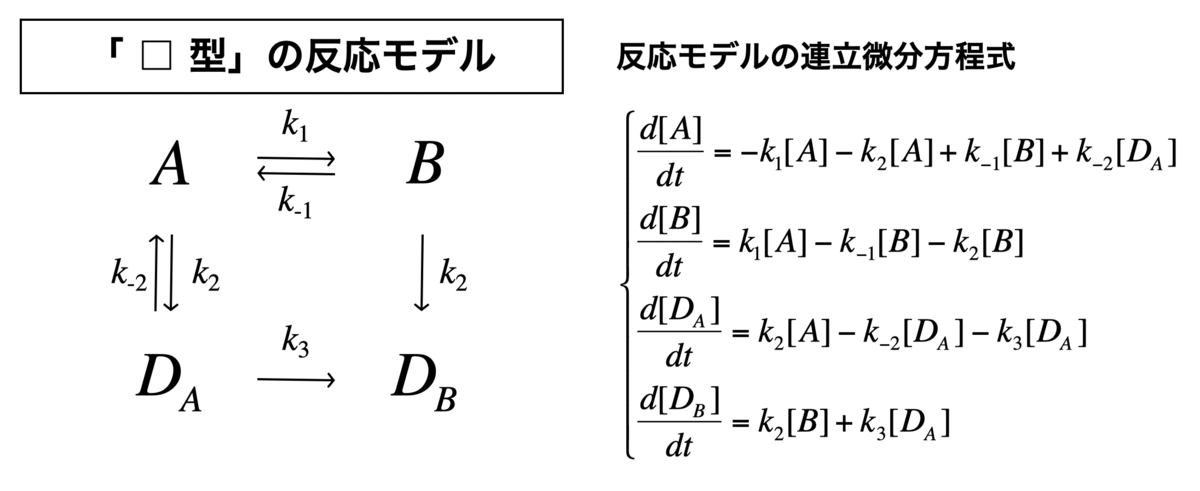
「□型」の反応モデル
「□型」の反応モデル
それでは、四角型の反応モデルの連立方程式を定義します。
Kinetics <- function ( t, c, parms){
k1 <- parms$ k1
k2 <- parms$ k2
k3 <- parms$ k3
k4 <- parms$ k4
k5 <- parms$ k5
r <- rep ( 0 , length ( c))
r[ 1 ] = - k1* c[ "A" ] - k3* c[ "A" ] + k2* c[ "B" ] + k4* c[ "DA" ]
r[ 2 ] = k1* c[ "A" ] - k2* c[ "B" ] - k3* c[ "B" ]
r[ 3 ] = k3* c[ "A" ] - k4* c[ "DA" ] - k5* c[ "DA" ]
r[ 4 ] = k3* c[ "B" ] + k5* c[ "DA" ]
return ( list ( r))}
次に、初期値を、[A]=1、[B]=1、[DA]=0、[DB]=0、k1=1、k2=0.8、k3=1、k4 = 0.5、k5 = 1に設定します。時間軸は0.1刻みにします。
cinit <- c ( A = 1 , B = 1 , DA = 0 , DB = 0 )
parms <- list ( k1 = 1 , k2 = 0.8 , k3 = 1 , k4 = 0.5 , k5 = 1 )
t <- seq ( 0 , 10 , by= 0.1 )
それでは、deSolve::ode関数で数値計算します。
Results <- deSolve:: ode ( y= cinit, times= t,
func= Kinetics, parms= parms, method= "lsoda" )
source ( "https://gist.githubusercontent.com/kumeS/c516415c9ab4d25a2a6ae078e4d87837/raw/5be7e171ae9ce03c6110fa6a1ccb20d69aa45412/accumulate_by.R" )
Dat <- data.frame ( Results)
Dat$ frame <- as.numeric ( rownames ( Dat))
Dat0 <- tidyr:: gather ( Dat, key= Mol, value= val, A, B, DA, DB, - c ( frame, time))
Dat1 <- Dat0 %>% accumulate_by ( ~ frame)
a <- nrow ( Dat0) / length ( unique ( Dat0$ Mol))
fig <- plotly:: plot_ly ( Dat1,
x = ~ time,
y = ~ val,
split = ~ Mol,
frame = ~ X,
type = 'scatter' ,
mode = 'lines' ) %>%
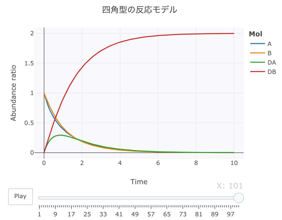
layout ( title = '四角型の反応モデル' ,
plot_bgcolor = "#e5ecf650" ,
xaxis = list ( title = 'Time' ),
yaxis = list ( title = 'Abundance ratio' ),
legend = list ( title= list ( text= '<b>Mol</b>' )),
margin = list ( l = 80 , r = 80 , b = 80 , t = 60 , pad = 0 )) %>%
animation_opts ( frame = a, transition = 0 , redraw = FALSE )
fig
fig %>% htmltools:: save_html ( file= "05_plotly_motion.html" )
https://kumes.github.io/Blog/R_ODE/05_plotly_motion.html
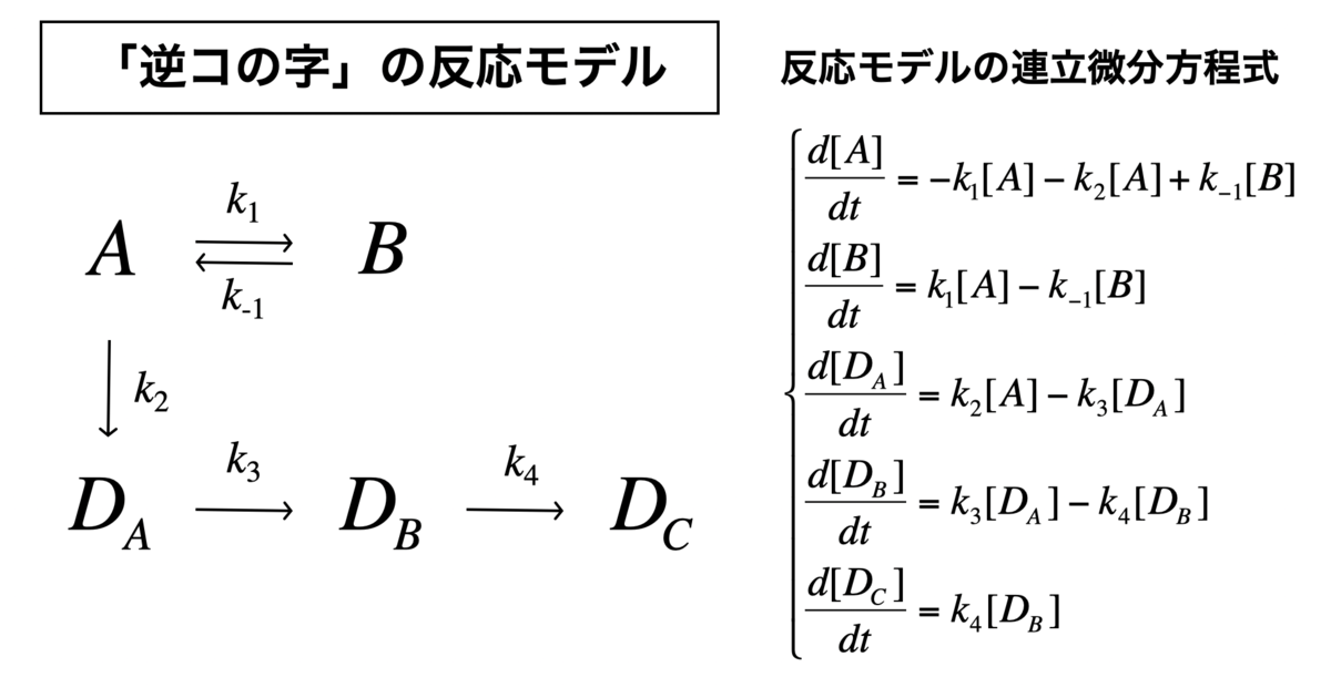
「逆コの字」の反応モデル
「逆コの字」の反応モデル
逆コの字型という感じで、ここまでくると名前の付け方が適当になりますね。
Kinetics <- function ( t, c, parms){
k1 <- parms$ k1
k2 <- parms$ k2
k3 <- parms$ k3
k4 <- parms$ k4
k5 <- parms$ k5
r <- rep ( 0 , length ( c))
r[ 1 ] = - k1* c[ "A" ] - k3* c[ "A" ] + k2* c[ "B" ]
r[ 2 ] = k1* c[ "A" ] - k2* c[ "B" ]
r[ 3 ] = k3* c[ "A" ] - k4* c[ "DA" ]
r[ 4 ] = k4* c[ "DA" ] - k5* c[ "DB" ]
r[ 5 ] = k5* c[ "DB" ]
return ( list ( r))}
次に、初期値を、[A]=1、[B]=1、[DA]=0、[DB]=0、[DC]=0、k1=1、k2=0.8、k3=1、k4 = 0.5、k5 = 1に設定します。時間軸は0.1刻みにします。
cinit <- c ( A = 1 , B = 1 , DA = 0 , DB = 0 , DC = 0 )
parms <- list ( k1 = 1 , k2 = 0.8 , k3 = 1 , k4 = 0.5 , k5 = 1 )
t <- seq ( 0 , 10 , by= 0.1 )
それでは、deSolve::ode関数で数値計算します。
Results <- deSolve:: ode ( y= cinit, times= t,
func= Kinetics, parms= parms, method= "lsoda" )
source ( "https://gist.githubusercontent.com/kumeS/c516415c9ab4d25a2a6ae078e4d87837/raw/5be7e171ae9ce03c6110fa6a1ccb20d69aa45412/accumulate_by.R" )
Dat <- data.frame ( Results)
Dat$ frame <- as.numeric ( rownames ( Dat))
Dat0 <- tidyr:: gather ( Dat, key= Mol, value= val, A, B, DA, DB, DC, - c ( frame, time))
Dat1 <- Dat0 %>% accumulate_by ( ~ frame)
a <- nrow ( Dat0) / length ( unique ( Dat0$ Mol))
fig <- plotly:: plot_ly ( Dat1,
x = ~ time,
y = ~ val,
split = ~ Mol,
frame = ~ X,
type = 'scatter' ,
mode = 'lines' ) %>%
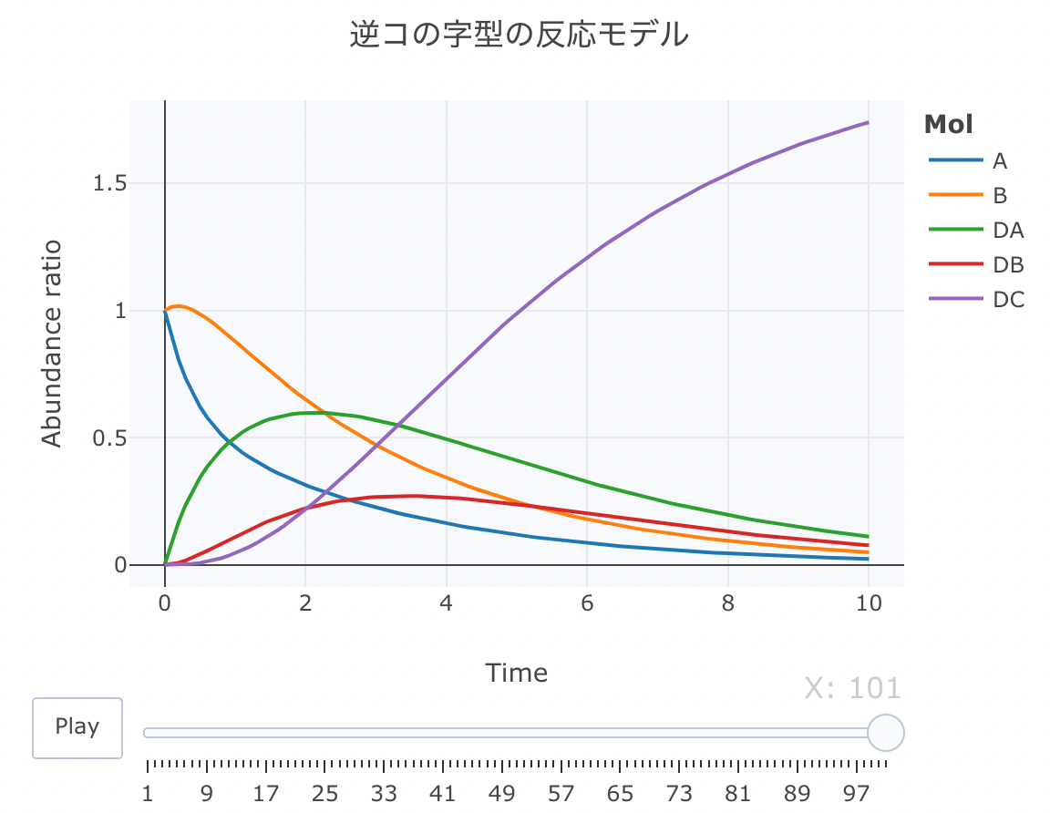
layout ( title = '逆コの字型の反応モデル' ,
plot_bgcolor = "#e5ecf650" ,
xaxis = list ( title = 'Time' ),
yaxis = list ( title = 'Abundance ratio' ),
legend = list ( title= list ( text= '<b>Mol</b>' )),
margin = list ( l = 80 , r = 80 , b = 80 , t = 60 , pad = 0 )) %>%
animation_opts ( frame = a, transition = 0 , redraw = FALSE )
fig
fig %>% htmltools:: save_html ( file= "06_plotly_motion.html" )
https://kumes.github.io/Blog/R_ODE/06_plotly_motion.html
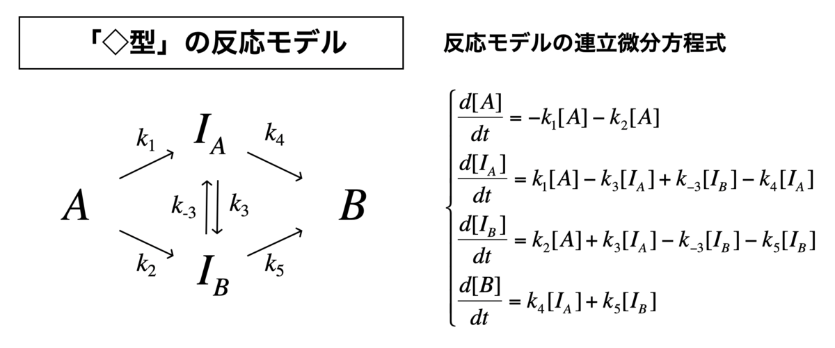
「◇型」の反応モデル
「◇型」の反応モデル
それでは、菱形モデルをやってみます。
このモデルは、A → Bの反応途中に、中間状態の平衡(IA ⇄ IB)を仮定しているモデルです。
Kinetics <- function ( t, c, parms){
k1 <- parms$ k1
k2 <- parms$ k2
k3 <- parms$ k3
k4 <- parms$ k4
k5 <- parms$ k5
k6 <- parms$ k6
r <- rep ( 0 , length ( c))
r[ 1 ] = - k1* c[ "A" ] - k2* c[ "A" ]
r[ 2 ] = k1* c[ "A" ] - k3* c[ "IA" ] + k4* c[ "IB" ] - k5* c[ "IA" ]
r[ 3 ] = k2* c[ "A" ] + k3* c[ "IA" ] - k4* c[ "IB" ] - k6* c[ "IB" ]
r[ 4 ] = k5* c[ "IA" ] + k6* c[ "IB" ]
return ( list ( r))}
次に、初期値を、[A]=1、[B]=0、[IA]=0、[IB]=0、k1=1、k2=0.8、k3=0.2、k4(=k-3) = 0.1、k5(=k4) = 1、k6(=k5) = 0.5に設定します。時間軸は0.1刻みにします。
今更ながら、cinitのインデックスの順番とlist(r)の順番は同じが良いらしいです。
cinit <- c ( A = 1 , IA = 0 , IB = 0 , B = 0 )
parms <- list ( k1 = 1 , k2 = 0.8 , k3 = 0.2 , k4 = 0.1 , k5 = 1 , k6 = 0.5 )
t <- seq ( 0 , 5 , by= 0.05 )
それでは、deSolve::ode関数で数値計算します。
Results <- deSolve:: ode ( y= cinit, times= t,
func= Kinetics, parms= parms, method= "lsoda" )
source ( "https://gist.githubusercontent.com/kumeS/c516415c9ab4d25a2a6ae078e4d87837/raw/5be7e171ae9ce03c6110fa6a1ccb20d69aa45412/accumulate_by.R" )
Dat <- data.frame ( Results)
Dat$ frame <- as.numeric ( rownames ( Dat))
Dat0 <- tidyr:: gather ( Dat, key= Mol, value= val, A, B, IA, IB, - c ( frame, time))
Dat1 <- Dat0 %>% accumulate_by ( ~ frame)
a <- nrow ( Dat0) / length ( unique ( Dat0$ Mol))
fig <- plotly:: plot_ly ( Dat1,
x = ~ time,
y = ~ val,
split = ~ Mol,
frame = ~ X,
type = 'scatter' ,
mode = 'lines' ) %>%
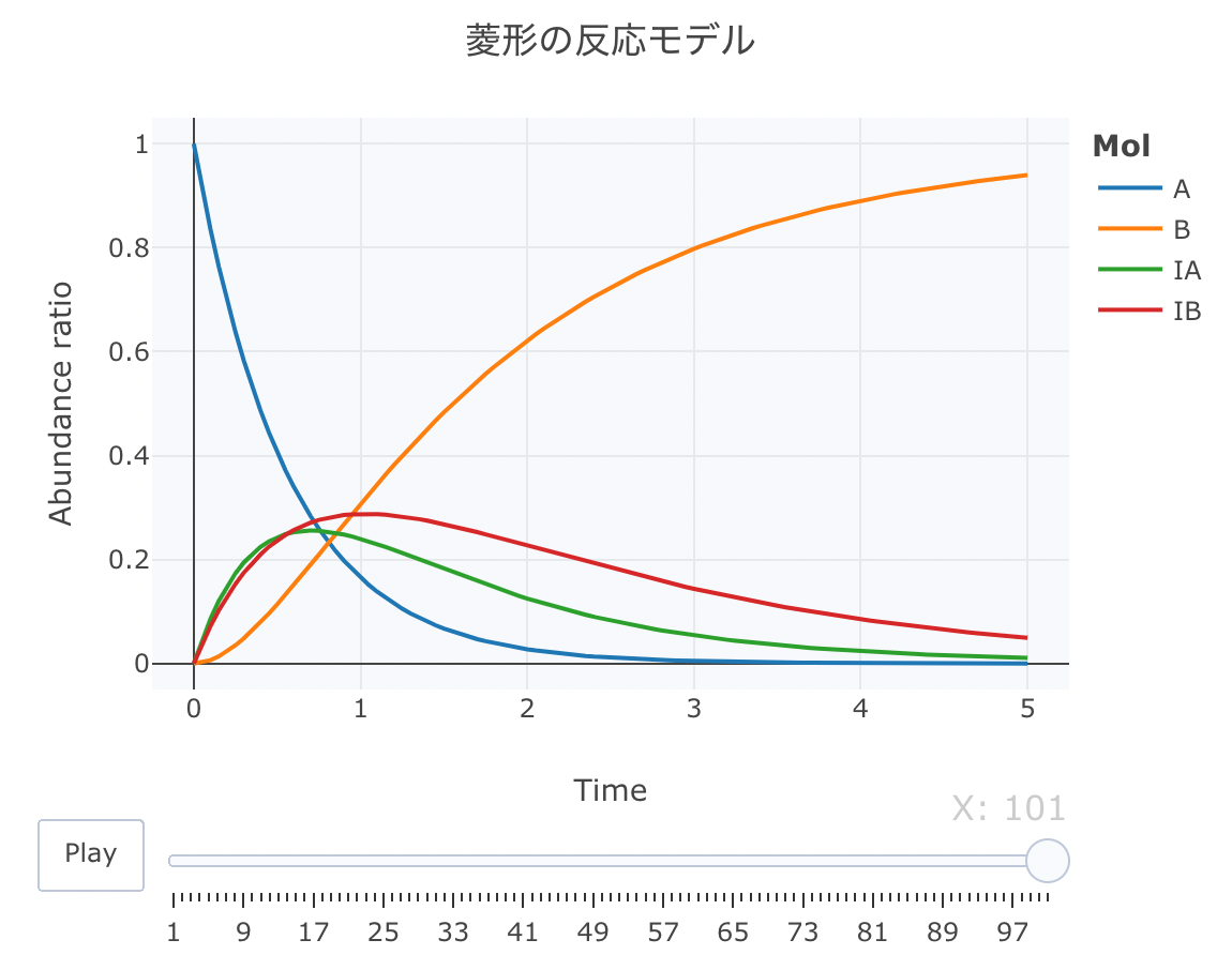
layout ( title = '菱形の反応モデル' ,
plot_bgcolor = "#e5ecf650" ,
xaxis = list ( title = 'Time' ),
yaxis = list ( title = 'Abundance ratio' ),
legend = list ( title= list ( text= '<b>Mol</b>' )),
margin = list ( l = 80 , r = 80 , b = 80 , t = 60 , pad = 0 )) %>%
animation_opts ( frame = a, transition = 0 , redraw = FALSE )
fig
fig %>% htmltools:: save_html ( file= "07_plotly_motion.html" )
https://kumes.github.io/Blog/R_ODE/07_plotly_motion.html
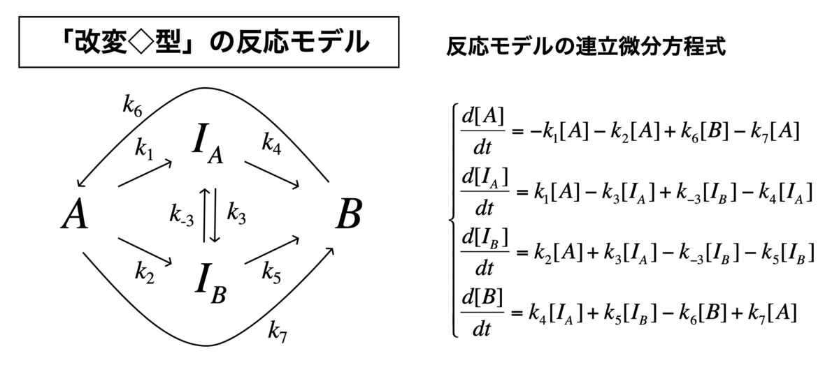
「改変◇型」の反応モデル
「改変◇型」の反応モデル
最後に、改変の菱形モデルをやります。
これは、上記の菱形モデルに加えて、A⇄Bの平衡反応を考慮したものです。
Kinetics <- function ( t, c, parms){
k1 <- parms$ k1
k2 <- parms$ k2
k3 <- parms$ k3
k4 <- parms$ k4
k5 <- parms$ k5
k6 <- parms$ k6
k7 <- parms$ k7
k8 <- parms$ k8
r <- rep ( 0 , length ( c))
r[ 1 ] = - k1* c[ "A" ] - k2* c[ "A" ] + k7* c[ "B" ] - k8* c[ "A" ]
r[ 2 ] = k1* c[ "A" ] - k3* c[ "IA" ] + k4* c[ "IB" ] - k5* c[ "IA" ]
r[ 3 ] = k2* c[ "A" ] + k3* c[ "IA" ] - k4* c[ "IB" ] - k6* c[ "IB" ]
r[ 4 ] = k5* c[ "IA" ] + k6* c[ "IB" ] - k7* c[ "B" ] + k8* c[ "A" ]
return ( list ( r))}
次に、初期値を、[A]=1、[B]=0、[IA]=0、[IB]=0、k1=1、k2=0.8、k3=0.2、k4(=k-3) = 0.1、k5(=k4) = 1、k6(=k5) = 0.5、k7(=k6) = 0.5、k8(=k7) = 0.75に設定します。時間軸は0.1刻みにします。
今更ながら、cinitのインデックスの順番とlist(r)の順番は同じが良いらしいです。
cinit <- c ( A = 1 , IA = 0 , IB = 0 , B = 0 )
parms <- list ( k1 = 1 , k2 = 0.8 , k3 = 0.2 , k4 = 0.1 , k5 = 1 , k6 = 0.5 , k7 = 0.5 , k8 = 0.75 )
t <- seq ( 0 , 5 , by= 0.05 )
それでは、deSolve::ode関数で数値計算します。
Results <- deSolve:: ode ( y= cinit, times= t,
func= Kinetics, parms= parms, method= "lsoda" )
source ( "https://gist.githubusercontent.com/kumeS/c516415c9ab4d25a2a6ae078e4d87837/raw/5be7e171ae9ce03c6110fa6a1ccb20d69aa45412/accumulate_by.R" )
Dat <- data.frame ( Results)
Dat$ frame <- as.numeric ( rownames ( Dat))
Dat0 <- tidyr:: gather ( Dat, key= Mol, value= val, A, B, IA, IB, - c ( frame, time))
Dat1 <- Dat0 %>% accumulate_by ( ~ frame)
a <- nrow ( Dat0) / length ( unique ( Dat0$ Mol))
fig <- plotly:: plot_ly ( Dat1,
x = ~ time,
y = ~ val,
split = ~ Mol,
frame = ~ X,
type = 'scatter' ,
mode = 'lines' ) %>%
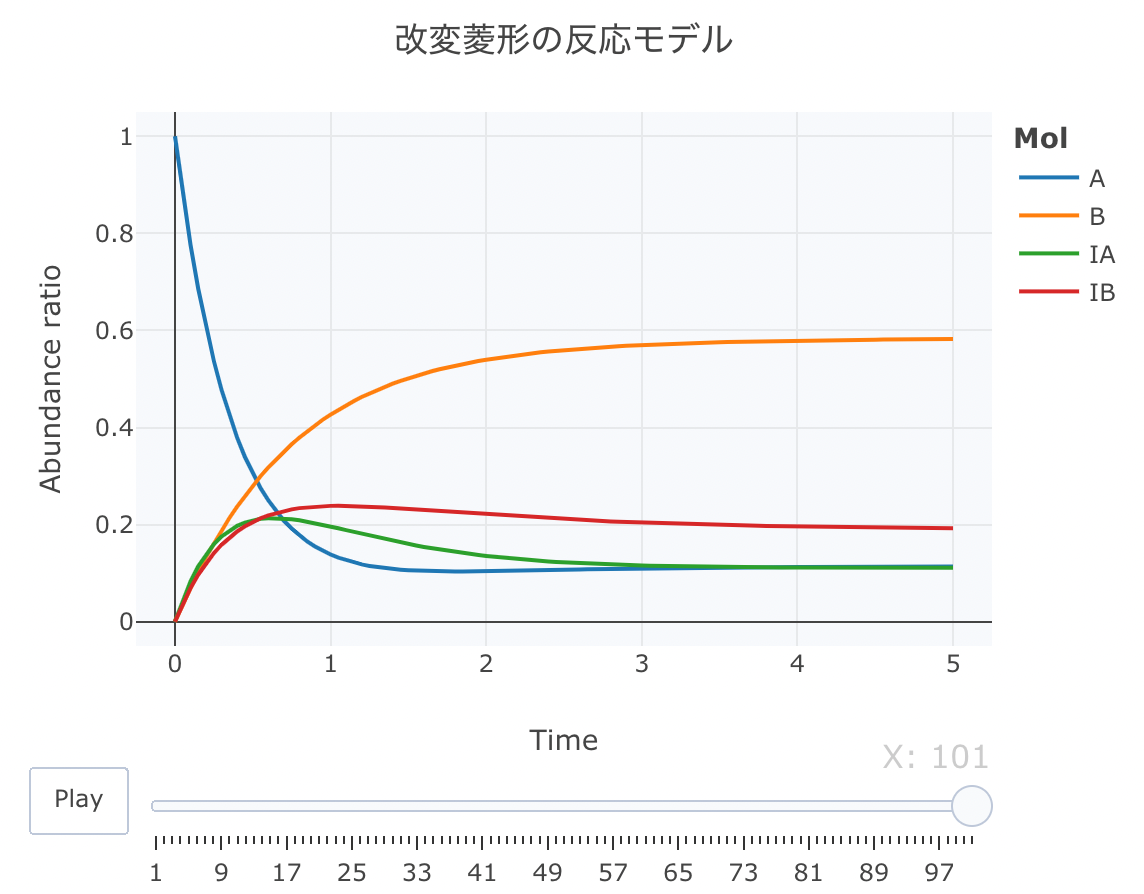
layout ( title = '改変菱形の反応モデル' ,
plot_bgcolor = "#e5ecf650" ,
xaxis = list ( title = 'Time' ),
yaxis = list ( title = 'Abundance ratio' ),
legend = list ( title= list ( text= '<b>Mol</b>' )),
margin = list ( l = 80 , r = 80 , b = 80 , t = 60 , pad = 0 )) %>%
animation_opts ( frame = a, transition = 0 , redraw = FALSE )
fig
fig %>% htmltools:: save_html ( file= "08_plotly_motion.html" )
https://kumes.github.io/Blog/R_ODE/08_plotly_motion.html
まとめ
「RでODE」というテーマで執筆しました。
ODEを通して、生化学反応の仕組みが少しでも理解できたら、数式を見ても楽しくなります。また、身近にODE計算できるツールとして、Rが利用できると、何かと便利です。
計算科学領域では、生化学的な反応を単にODEで解くだけではなくて、細胞空間レベルで反応シミュレーションすることも行われています。
最近では、Zane R. Thornburgらの研究 によって、最小細胞である、JCVI-syn3Aの全細胞完全動力学モデル(WCM)についても報告されている。
ミクロな反応シミュレーションによって、生命科学の理解はますます進んでいくものと思われますね。
補足: 速度論の数学的基礎 (解析式)
以下、解析式を導く際の数学的な解説をしています。ご参考までに。
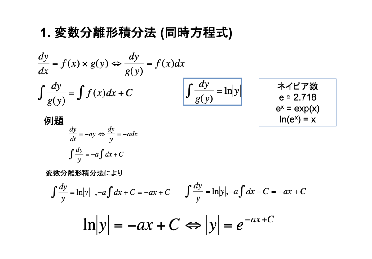
1. 変数分離形積分法 (同時方程式)
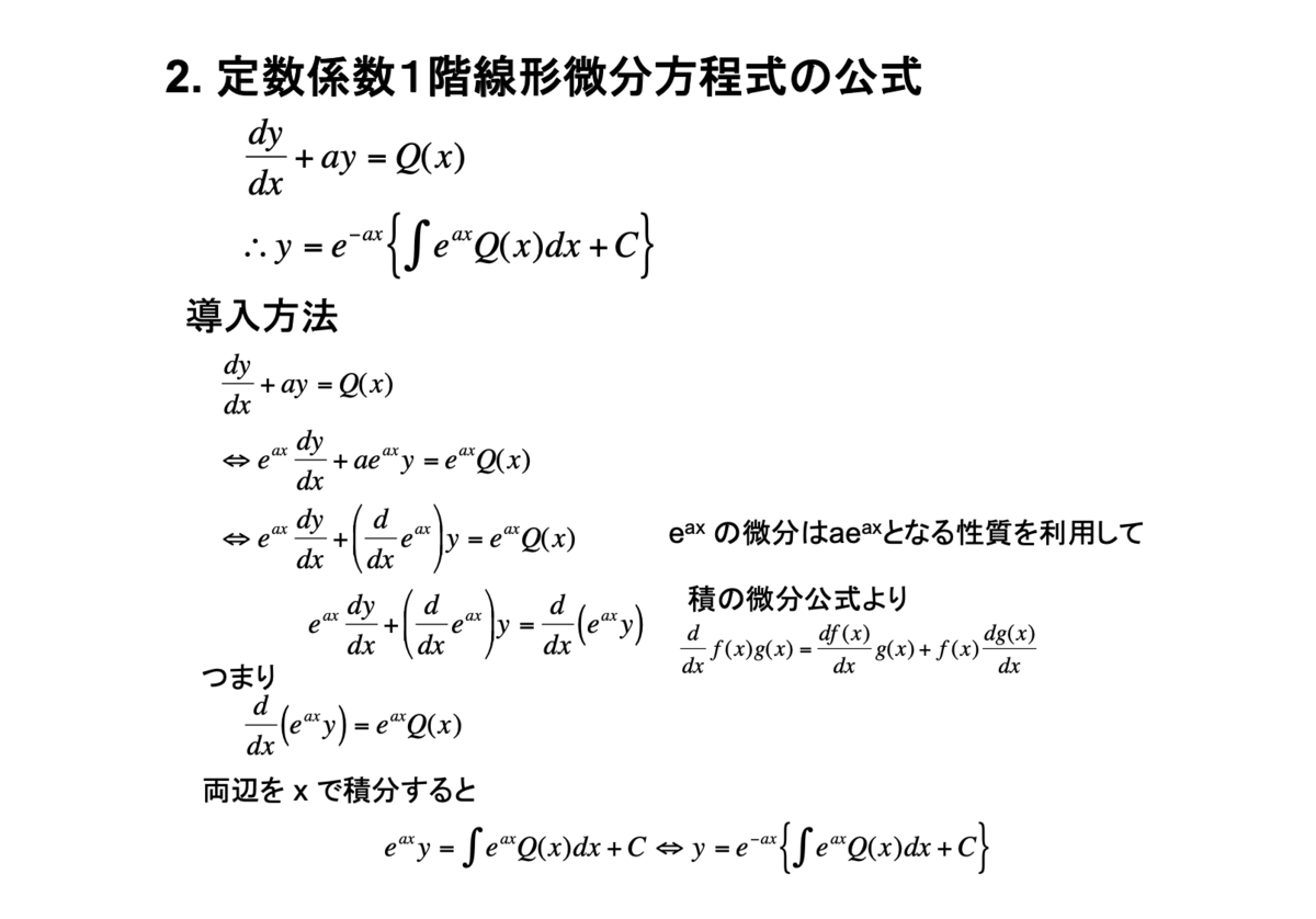
2. 定数係数1階線形微分方程式の公式
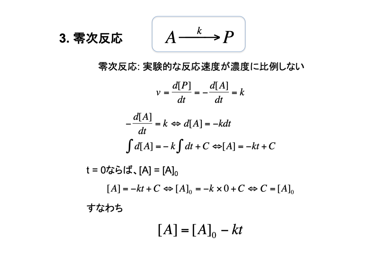
3. 零次反応
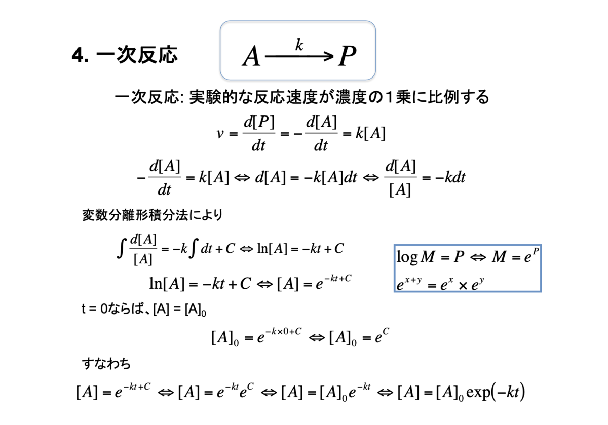
4. 一次反応
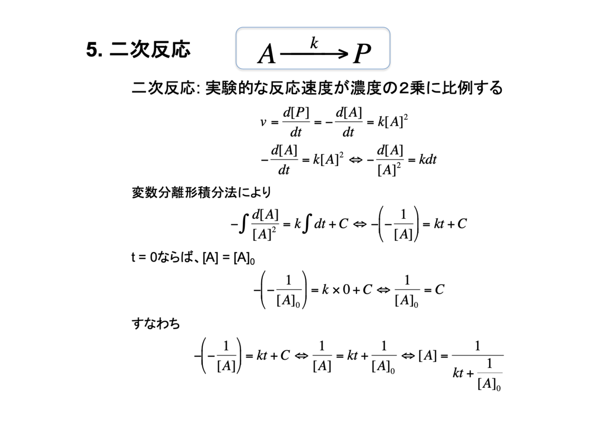
5.二次反応
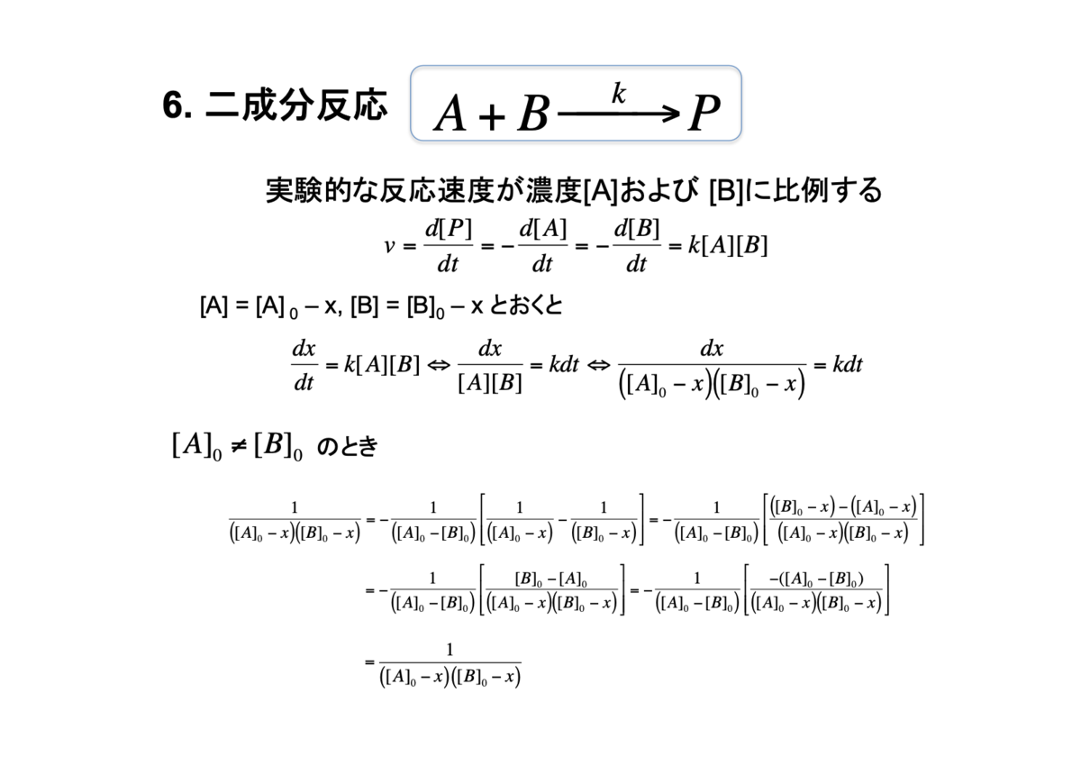
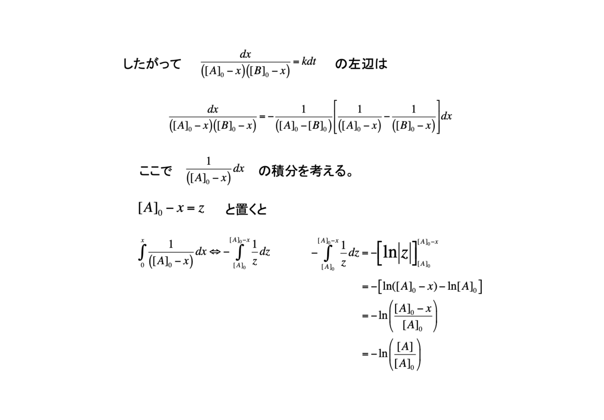
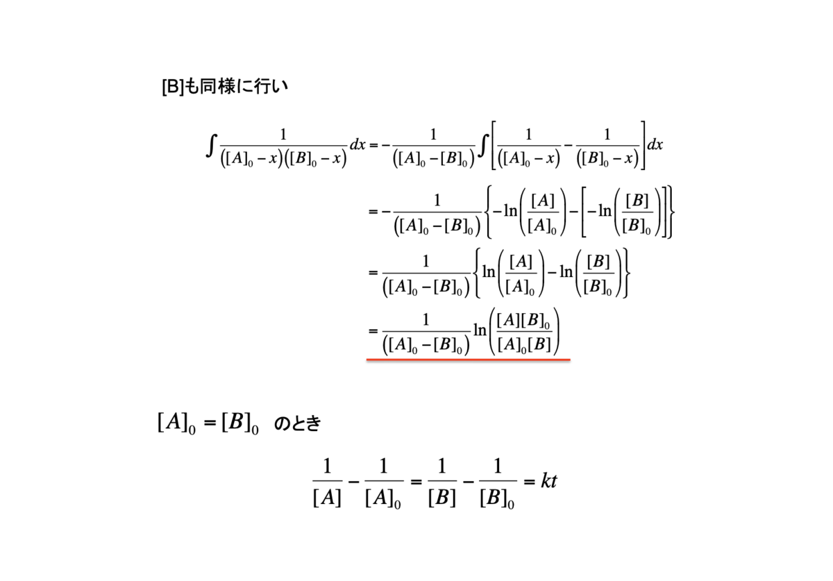
6. 二成分反応
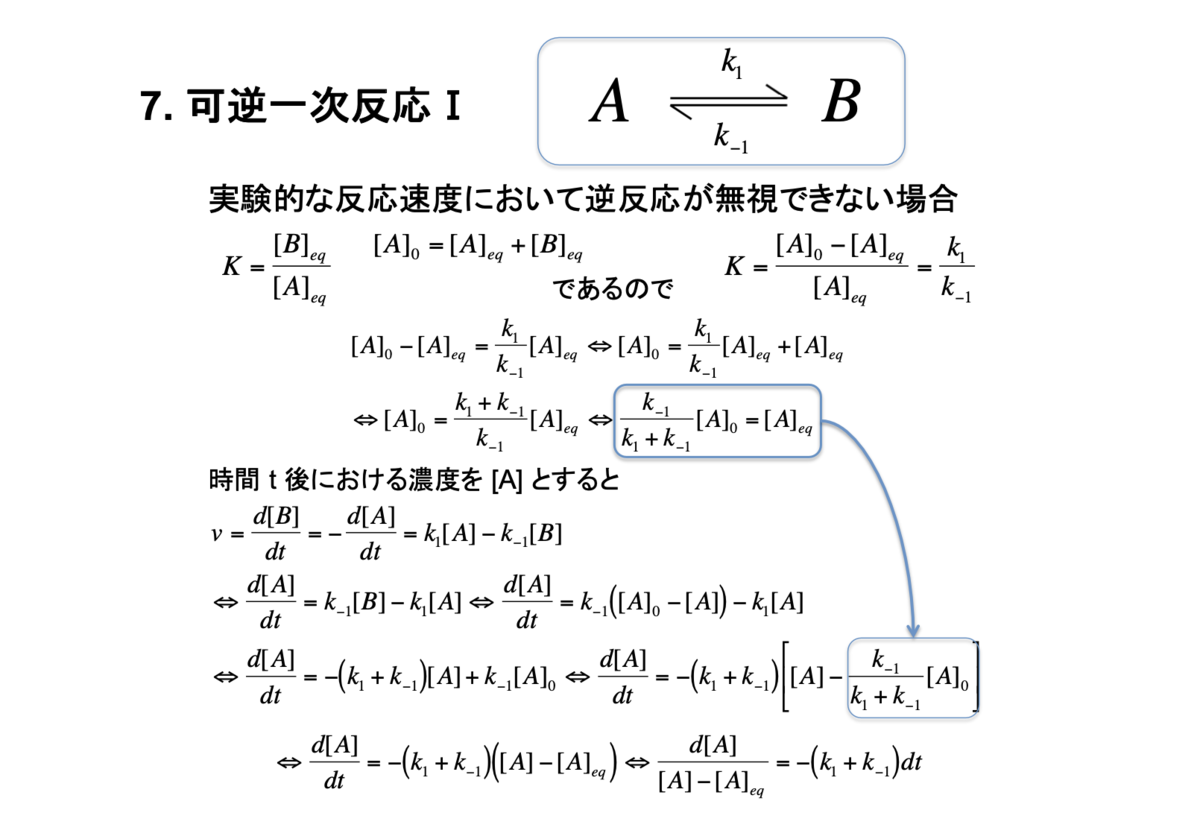
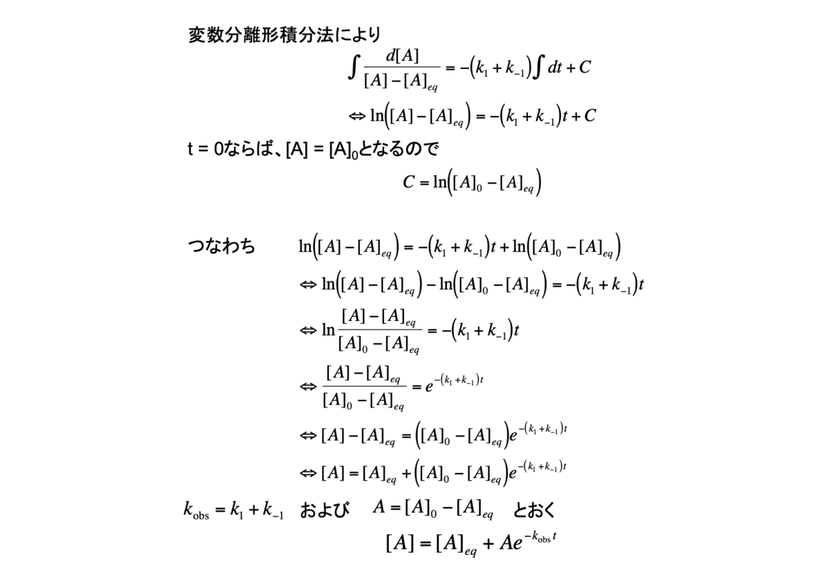
7. 可逆一次反応I
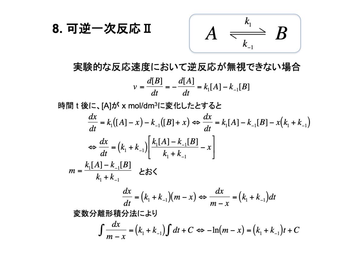
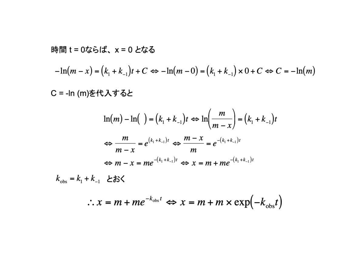
8. 可逆一次反応II
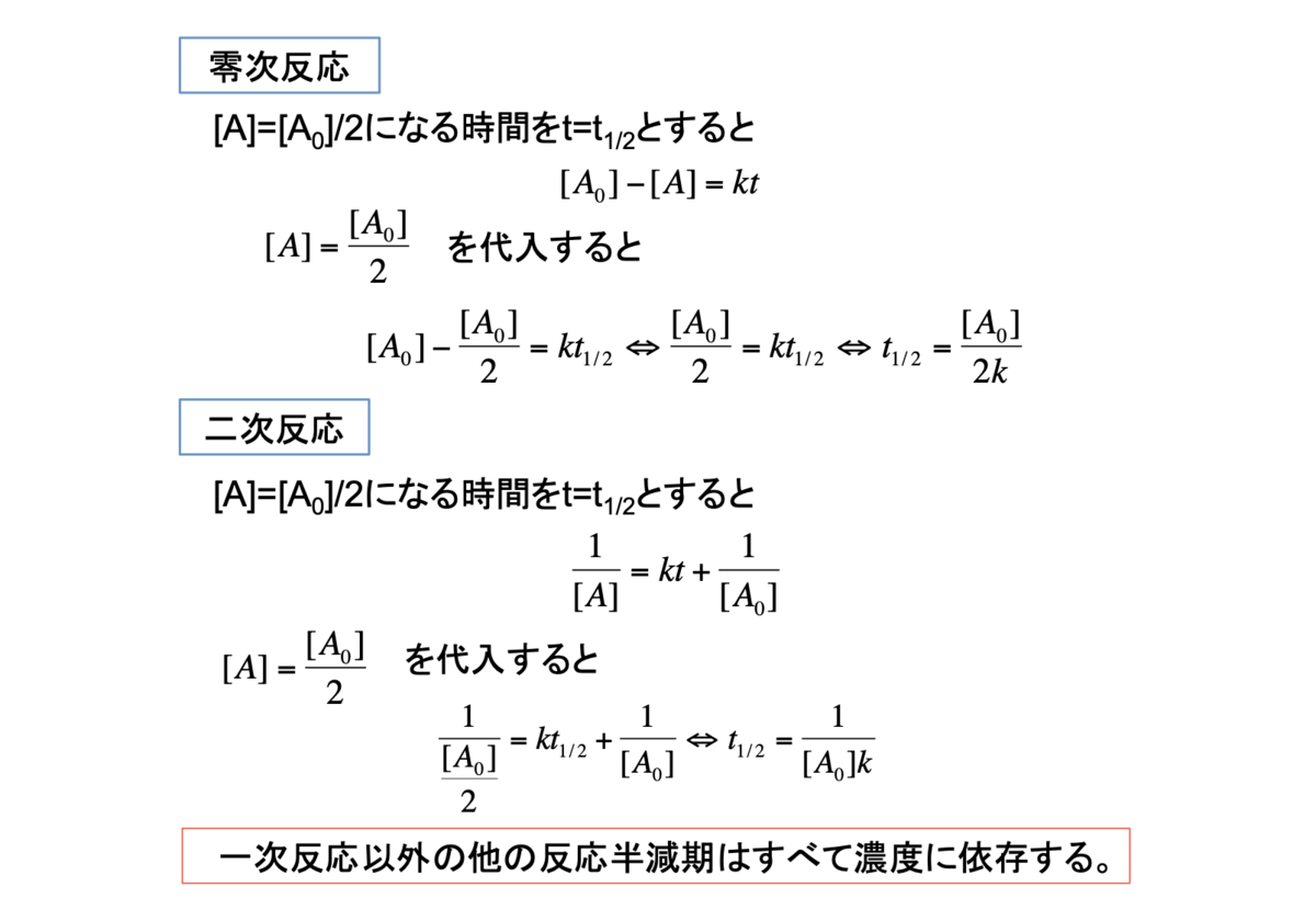
9. 半減期
参考資料
www.anarchive-beta.com
qiita.com
plotly.com


