
はじめに
いま、このブログでは「アニメーショングラフ」推しなのですが、、、 「バー・チャート・レース」が少し見難いようにも思えてきて、 散布図(スキャッチャープロット)のモーションチャートをやってみることにしました。
この記事では、S&Pダウ・ジョーンズ・インデックスが算出しているアメリカの株価指数の1つである、SP100の各銘柄の時系列データ(日足)について、「モーションチャート(Motion chart)」を作成します。
SP100はちょうど100銘柄から構成されているので、100点のスキャッチャープロットとなります。
さぁ、モーションチャート作図をやっていきましょう。
関連記事
実行環境
実行環境
macOS Big Sur (バージョン11.5.2)
MacBook Air (M1, 2020)
チップ Apple M1
メモリ 16GB
パッケージ準備
今回使用する、Rパッケージを準備します。
ここをスキップして、以下のスクリプトを読み込むのでもOKです。
#パッケージ・インストール
pack <- c("rvest", "quantmod", "magrittr", "tidyr", "tidyverse", "plotly", "gapminder", "dygraphs", "htmltools")
install.packages(pack[!(pack %in% unique(rownames(installed.packages())))])

#ロード
for(n in 1:length(pack)){ eval(parse(text = paste0("library(", pack[n], ")"))) }; rm("n", "pack")
getSP100.Rスクリプトを読み込んでも、Rパッケージがインストールできます。
同時に、今回使用する、getSP100_list、SP100_ChartData、SP100_ChartData_modといった関数群を読み込まれます。
#スクリプトの読み込み
source("https://gist.githubusercontent.com/kumeS/e8dca57f2ba101b2ef9714ce59400460/raw/dfdcf08fdbc7fbd41eb909520c4bb0bc52adf460/getSP100.R")
SP100銘柄のデータ取得
まず、getSP100_list関数では、ウェブスクレイピングを介して、ウィキペディアの該当ページからSP100の銘柄リストを取得します。
さて、下記を実行していきます。
#SP100銘柄リストの取得
SP100List <- getSP100_list()

#表示
head(SP100List)
#                       Company Ticker                 Sector
#1                        Apple   AAPL Information Technology
#2                       AbbVie   ABBV            Health Care
#3                       Abbott    ABT            Health Care
#4                    Accenture    ACN Information Technology
#5                        Adobe   ADBE Information Technology
#6 American International Group    AIG             Financials
次に、2022年年初からのSP100のデータを取得します。
#SP100のデータ取得: 実行時間 3分くらい
ChartData <- SP100_ChartData(Dat=SP100List, term=c("2022-01-01", "2022-12-31"))

#いったん、RDS保存
saveRDS(ChartData, "SP100_ChartData.Rds")

#ダウンロード
#browseURL("https://github.com/kumeS/Blog/raw/master/R_BarChart/Chart_03/SP100_ChartData.Rds")
#ChartData <- readRDS("SP100_ChartData.Rds")

#表示
head(ChartData)
#                       Company Ticker                 Sector       date close dclose dclose2 ranking
#1                        Apple   AAPL Information Technology 2022-01-03   100      0 #F0F5F0       1
#2                       AbbVie   ABBV            Health Care 2022-01-03   100      0 #F0F5F0       2
#3                       Abbott    ABT            Health Care 2022-01-03   100      0 #F0F5F0       3
#4                    Accenture    ACN Information Technology 2022-01-03   100      0 #F0F5F0       4
#5                        Adobe   ADBE Information Technology 2022-01-03   100      0 #F0F5F0       5
#6 American International Group    AIG             Financials 2022-01-03   100      0 #F0F5F0       6
このステップで、SP100の銘柄リストと値動きのデータが取得できました。
続いて、SP100_ChartData_mod関数で、データの補正を行います。
#データ補正: 全銘柄を使用
ChartData1 <- SP100_ChartData_mod(ChartData)

#表示
head(ChartData1)
#  Company Ticker      Sector CompanyTicker    CompanySector       date close dclose dclose2 ranking
#1      3M    MMM Industrials      3M (MMM) 3M (Industrials) 2022-01-03 100.0    0.0 #F0F5F0      64
#2      3M    MMM Industrials      3M (MMM) 3M (Industrials) 2022-01-04 101.4    1.4 #F0F5F0      38
#3      3M    MMM Industrials      3M (MMM) 3M (Industrials) 2022-01-05 101.0    1.0 #F0F5F0      40
#4      3M    MMM Industrials      3M (MMM) 3M (Industrials) 2022-01-06 100.1    0.1 #F0F5F0      46
#5      3M    MMM Industrials      3M (MMM) 3M (Industrials) 2022-01-07 101.2    1.2 #F0F5F0      42
#6      3M    MMM Industrials      3M (MMM) 3M (Industrials) 2022-01-10  99.8   -0.2 #FCF3F3      52
plotlyによるモーションチャート(motion chart)の作図
それでは、取得したSP100の値動きデータを使って、モーションチャートを作成します。 値動きの大きさによって、マーカーのサイズが変わるように設定します。
#のべ日の作成
ChartData1$Day <- as.numeric(ChartData1$date) - min(as.numeric(ChartData1$date)) + 1
#マーカーのサイズ
ChartData1$Size <- (4*abs(ChartData1$dclose)/100 +1)*5
#サイズの範囲
range(ChartData1$Size)
#[1]  5.00 21.58

#plot_ly実行
fig <- plot_ly(ChartData1,
    x = ~ranking,
    y = ~close,
    size = ~Size,
    color = ~Sector,
    frame = ~Day,
    text = ~CompanySector,
    hoverinfo = "text",
    hovertemplate = paste('ranking: %{x}', '<br>%{text}',
                          '<br>Relative: %{y}<extra></extra>'),
    type = 'scatter',
    mode = 'markers'
  ) %>%
  layout(title = 'SP100 Y2022',
         plot_bgcolor = "#e5ecf650",
         xaxis = list(title = 'Ranking'),
         yaxis = list(title = 'Relative price'),
         legend = list(title=list(text='<b>Sector</b>')))

#作図: 30秒くらいかかる
fig

#保存
fig %>% htmltools::save_html(file="SP100_motion_chart.html")
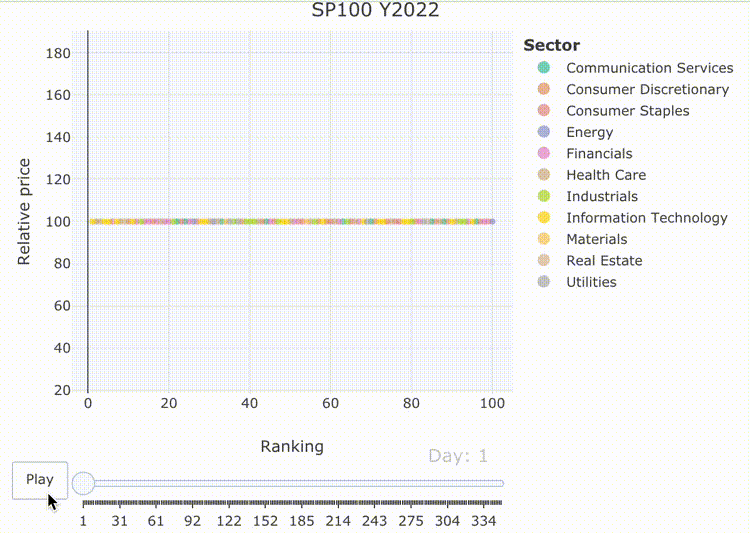
散布図だと、プロットがガチャガチャしても、何だか許容できますね。
dygraphsによるインタラクティブな作図
dygraphsパッケージは、dygraphs JavaScriptチャート・ライブラリへのRインターフェースです。 Rで時系列データを図表化するために、豊富な機能を提供しています。
このdygraphsパッケージは、xts時系列オブジェクト(または、xtsに変換可能なあらゆるオブジェクト)を自動的にプロットします。
#ワイド型への変換
ChartData2 <- ChartData1[,c("CompanySector", "date", "close")]
ChartData2.s <- spread(ChartData2, key = CompanySector, value = close)

#行名を変更する
rownames(ChartData2.s) <- as.character(ChartData2.s$date)
ChartData2.s <- ChartData2.s[,-1]

#表示(一部)
head(ChartData2.s)
#           3M (Industrials) Abbott (Health Care) AbbVie (Health Care)
#2022-01-03            100.0                100.0                100.0
#2022-01-04            101.4                 97.6                 99.8
#2022-01-05            101.0                 97.2                100.3
#2022-01-06            100.1                 97.2                 99.9
#2022-01-07            101.2                 97.5                 99.6
#2022-01-10             99.8                 97.3                100.7

#5つのサンプリング
x <- sample(1:ncol(ChartData2.s), 5)

#5つの可視化
p2 <- dygraph(ChartData2.s[,x],
        main = "SP100 Y2022",
        ylab = "Relative price") %>%
  dyRangeSelector(height = 20)  %>%
  dyLegend(show = "follow", width = 250, hideOnMouseOut = T, labelsSeparateLines = T)

#可視化
p2

#保存
p2 %>% htmltools::save_html(file="SP100_dygraph_p2.html")
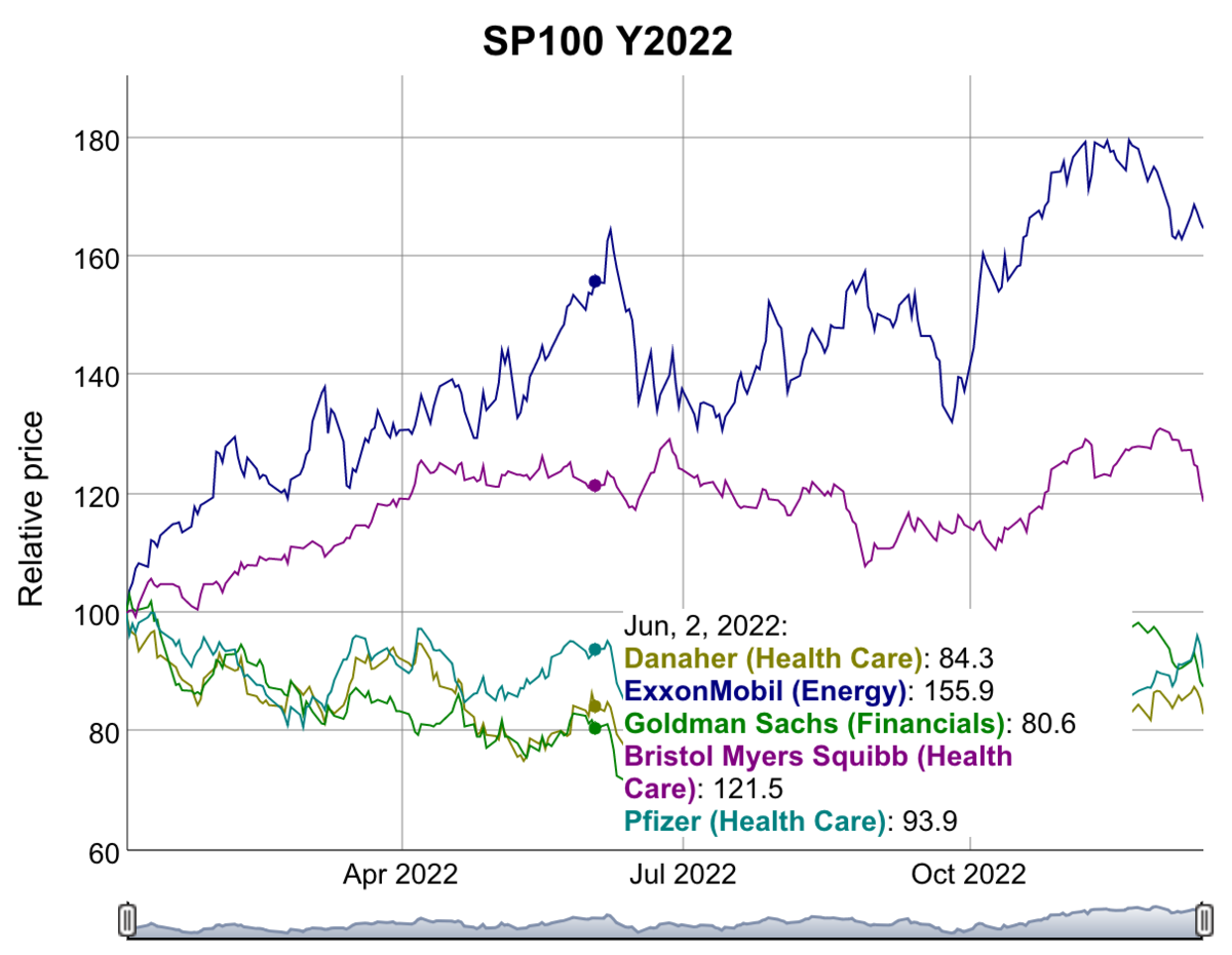
dygraphはプロットはサンプル数が多くなるとあまり使い物にならないかも。。 せいぜい、3-5サンプルくらいまでかな。
まとめ
SP100銘柄の2022年年初からのモーションチャートを作成しました。
バーがガンガン動く「バーチャートレース」よりも、 散布図のモーションチャートの方が目に優しい気がします。 私だけかもですが。
補足
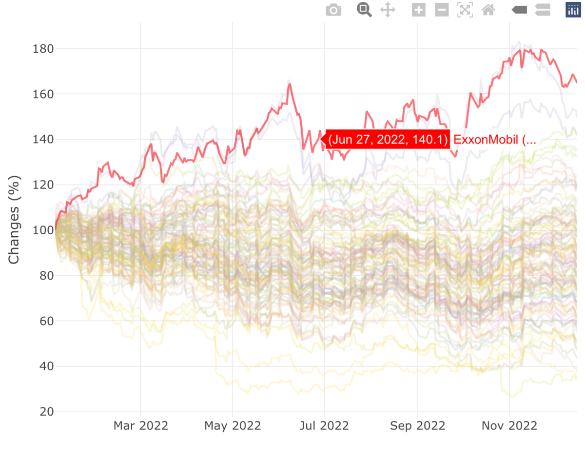
plotlyによるインタラクティブチャート + ハイライト
ハイライトした、plotlyチャートの作成をやってみました。
#表示
head(ChartData1)

#ハイライト表示
g <- highlight_key(ChartData1, ~Ticker)

#作図
p <- plot_ly(g) %>%
  group_by(Ticker) %>%
  add_lines(x = ~date, y = ~close, color = ~CompanySector) %>%
  layout(xaxis = list(title = ""),
         yaxis = list(title = "Changes (%)"), showlegend = F) %>%
  highlight(selected = attrs_selected(showlegend = FALSE)) %>%
  highlight(on = "plotly_click",
                off = "plotly_doubleclick",
                persistent = FALSE,
                color = "red",
                selected = attrs_selected(opacity = 0.5))

#可視化
p

#保存
p %>% htmltools::save_html(file="SP100_plot_ly_p.html")
ggplotlyによるインタラクティブチャート
plotlyパッケージ内のggplotlyという関数で、ggplot2::ggplot()のオブジェクトを plotlyオブジェクトに変換できる。マジで!!
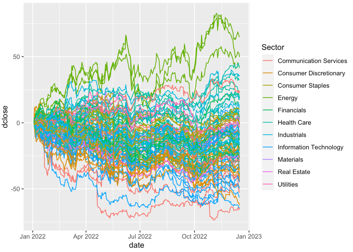
#表示
head(ChartData1)

#ggplotで作図
p <- ggplot(ChartData1,
       aes(x = date, y = dclose,
           group = CompanySector,
           color = Sector)) +
  geom_line()

#ggplotで可視化
p

##Plotlyで可視化
p1 <- ggplotly(p)

#保存
p1 %>% htmltools::save_html(file="SP100_ggplotly_p1.html")
これが、ggplotで可視化した結果です。
これが、ggplotlyで可視化した結果です。
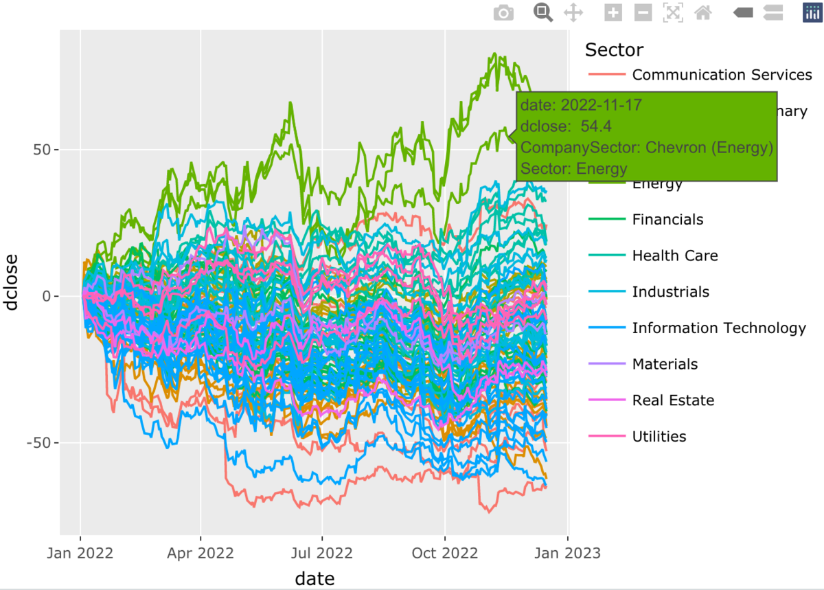
この変換はとても簡単で、感動的です。
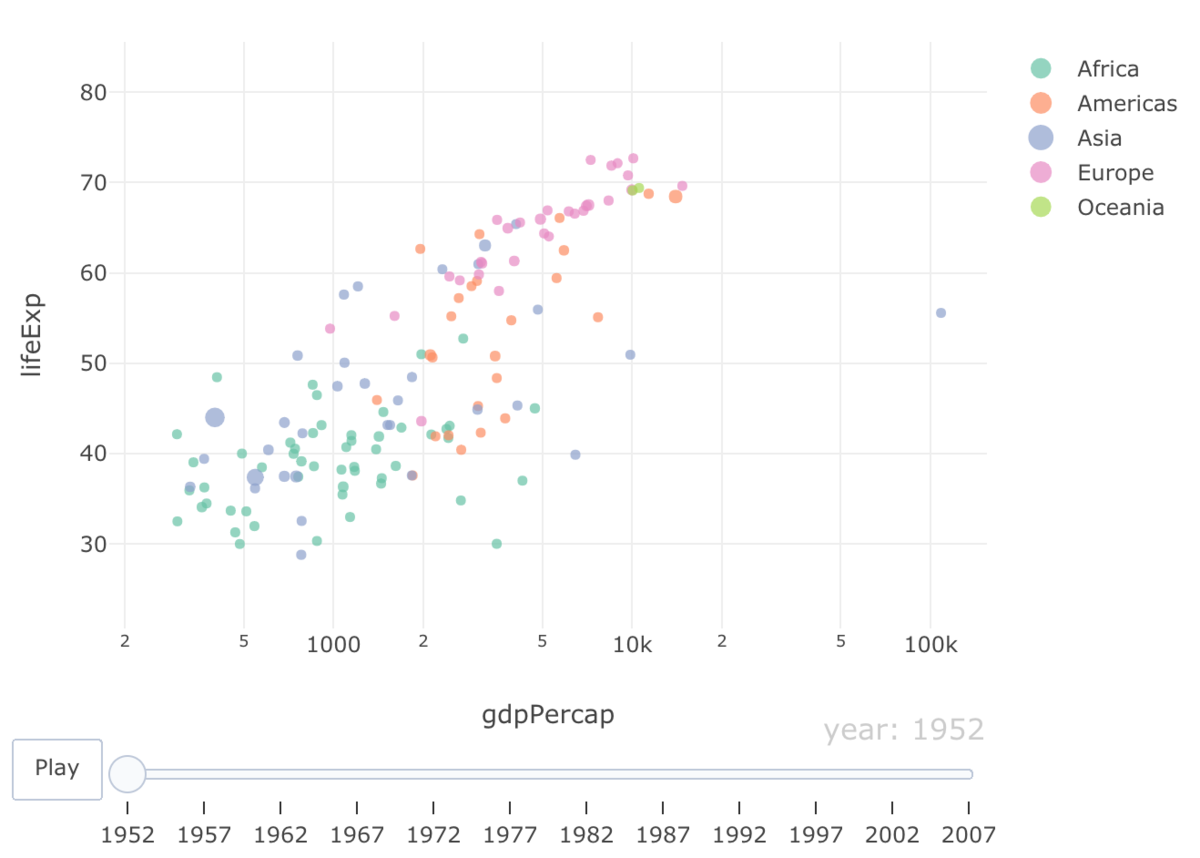
plotlyによるモーションチャートの実行テスト
gapminderのデータセットには、 国や地域ごと平均余命、人口、一人当たりのGDPを経時データが含まれています。
#テストデータ
df <- gapminder

#表示
head(df)
#  country     continent  year lifeExp      pop gdpPercap
#  <fct>       <fct>     <int>   <dbl>    <int>     <dbl>
#1 Afghanistan Asia       1952    28.8  8425333      779.
#2 Afghanistan Asia       1957    30.3  9240934      821.
#3 Afghanistan Asia       1962    32.0 10267083      853.
#4 Afghanistan Asia       1967    34.0 11537966      836.
#5 Afghanistan Asia       1972    36.1 13079460      740.
#6 Afghanistan Asia       1977    38.4 14880372      786.

#plot_ly実行
fig <- plot_ly(df,
    x = ~gdpPercap,
    y = ~lifeExp,
    size = ~pop,
    color = ~continent,
    frame = ~year,
    text = ~country,
    hoverinfo = "text",
    type = 'scatter',
    mode = 'markers'
  )

#レイアウト
fig <- fig %>% layout(
    xaxis = list( type = "log" )
  )

#作図
fig

#保存
fig %>% htmltools::save_html(file="test_motion_chart.html")
ffmpegによる、mov形式をgifに変換する
ターミナルを起動して、ffmpegで変換します。
#インストール
brew install ffmpeg

#MOV形式からのgif変換: 横幅を750にする
ffmpeg -i input.mov -vf scale=750:-1 -r 10 output.gif