
- はじめに
- BTCの月足データの平均足チャートを作成する
- BTCの週足データの平均足チャートを作成する
- BTCの日足データの平均足チャートを作成する
- dygraphsで複数のローソクチャートを描く
- まとめ
- 補足
- Rコード
- 参考資料
はじめに
平均足(Heikin-Ashi)とは、通常「1日分」のデータを使ってローソクチャートを作成するところを、その倍の「2日分」のデータを用いて作成するローソクチャートのことを言います。
そのため、細かなノイズが省かれて、トレンドの流れを視覚的に把握しやすいチャート**になると考えられています。また、海外でも、「Heikin-Ashi」と言われるほど、一般的に浸透しているテクニカルなチャートのようですね。
平均足の見方としては、 「陽線が連続すると、上昇トレンド」、 「陰線が連続すると、下降トレンド」と分かり易いです。 また、ローソク足の実体の大きさがトレンドの勢いを示すようです。
今回、ビットコイン(BTC)のデータとggplot2を使って、平均足のキャンドルチャートを作成することにします。 また、ストキャスティクスRSIなどのテクニカル指標も併せてやってみたいと思います。
関連パッケージ
まずは、Rで、関連パッケージをインストールします。
#パッケージ・インストール
pack <- c("quantmod", "dygraphs", "htmltools", "magrittr", "TTR", "xts", "ggplot2", "gridExtra", "lubridate")
install.packages(pack[!(pack %in% unique(rownames(installed.packages())))])

#ロード
for(n in 1:length(pack)){ eval(parse(text = paste0("library(", pack[n], ")"))) }; rm("n", "pack")
また、平均足を計算する関数などのスクリプト(Heikin_Ashi.R)を読み込みます。 上記のインストール実行も含まれます。
source("https://gist.githubusercontent.com/kumeS/2fc0b2e020044710226d1bed51c45ad2/raw/3de658478008d4045f9914f8a0fddba7bc2b8eb5/Heikin_Ashi.R")
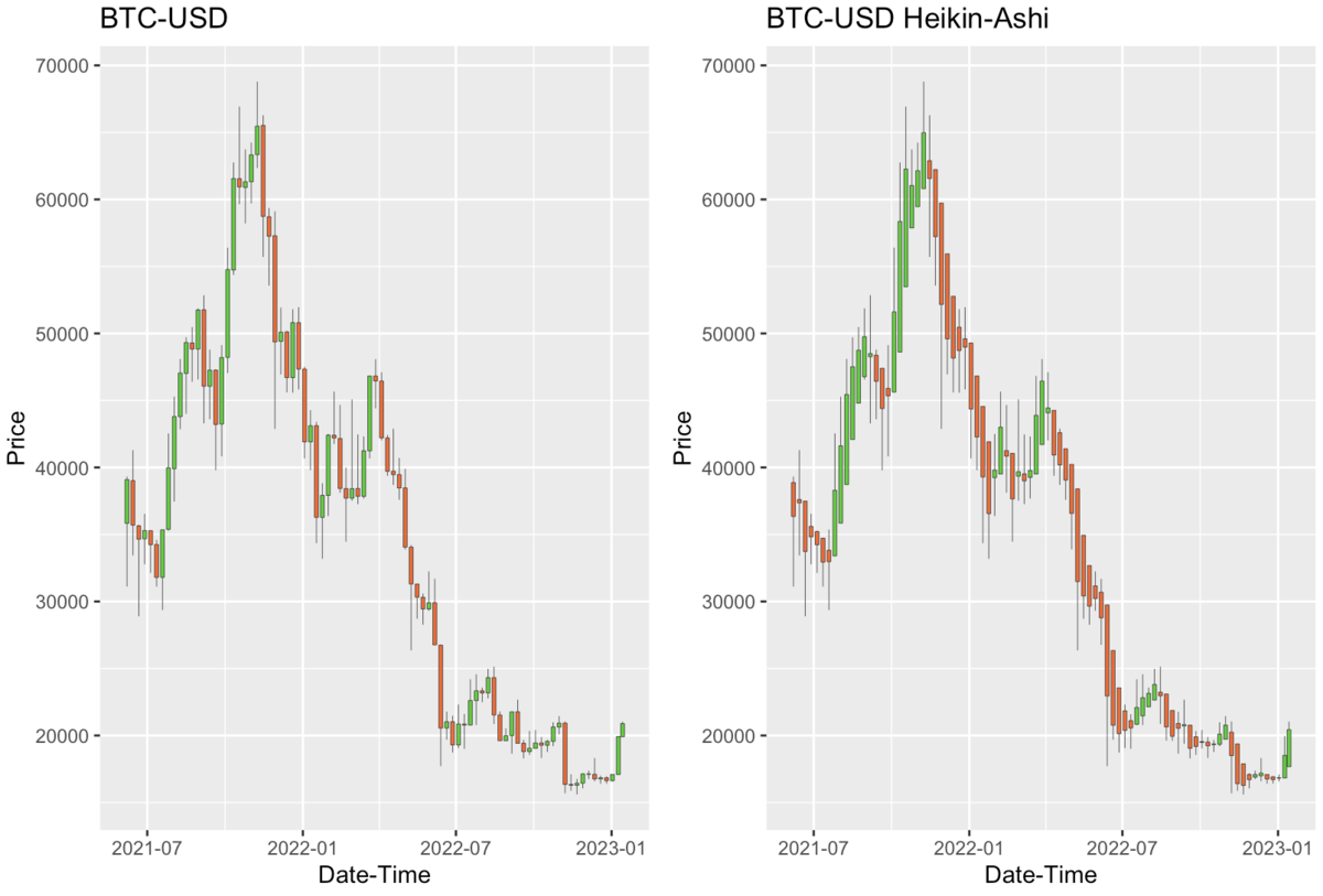
BTCの月足データの平均足チャートを作成する
まずは、BTCの月足データから、平均足チャートを作成します。
quantmod::getSymbols関数で、periodicityを「monthly」に設定することで月足データが得られます。期間は、「2014-10-01」以降としています。
#月足データの取得: 2014年10月以降
BTCm <- getSymbols("BTC-USD",
           from = "2014-10-01",
           to = "2023-12-31",
           periodicity = 'monthly',
           src = "yahoo",
           verbose = F,
           auto.assign=FALSE)

#列名の変更
BTCm <- setNames(BTCm,
                 nm = c("Open", "High", "Low", "Close", "Volume", "Adjusted"))

#表示
head(BTCm)
#              Open    High     Low   Close     Volume Adjusted
#2014-10-01 387.427 411.698 289.296 338.321  902994450  338.321
#2014-11-01 338.650 457.093 320.626 378.047  659733360  378.047
#2014-12-01 378.249 384.038 304.232 320.193  553102310  320.193
#2015-01-01 320.435 320.435 171.510 217.464 1098811912  217.464
#2015-02-01 216.867 265.611 212.015 254.263  711518700  254.263
#2015-03-01 254.283 300.044 236.515 244.224  959098300  244.224

#表示
tail(BTCm)
#               Open     High      Low    Close       Volume Adjusted
#2022-09-01 20050.50 22673.82 18290.31 19431.79 1.123272e+12 19431.79
#2022-10-01 19431.11 20988.39 18319.82 20495.77 9.579034e+11 20495.77
#2022-11-01 20494.90 21446.89 15599.05 17168.57 1.224532e+12 17168.57
#2022-12-01 17168.00 18318.53 16398.14 16547.50 5.413567e+11 16547.50
#2023-01-01 16547.91 19964.32 16521.23 19909.57 2.162587e+11 19909.57
#2023-01-14 19907.83 21035.62 19907.83 20832.73 4.514126e+10 20832.73

#ggChandlesによるキャンドルチャート
p1 <- ggChandles(x=BTCm,
                 term=c("2020-01-01", "2023-12-31"),
                 TsukiAshi=TRUE)

#平均足のキャンドルチャート
p2 <- ggChandles(heikin_ashi(BTCm),
                 term=c("2020-01-01", "2023-12-31"),
                 Tittle="BTC-USD Heikin-Ashi",
                 TsukiAshi=TRUE)

#複数図のプロット
gridExtra::grid.arrange(p1, p2, nrow = 1)
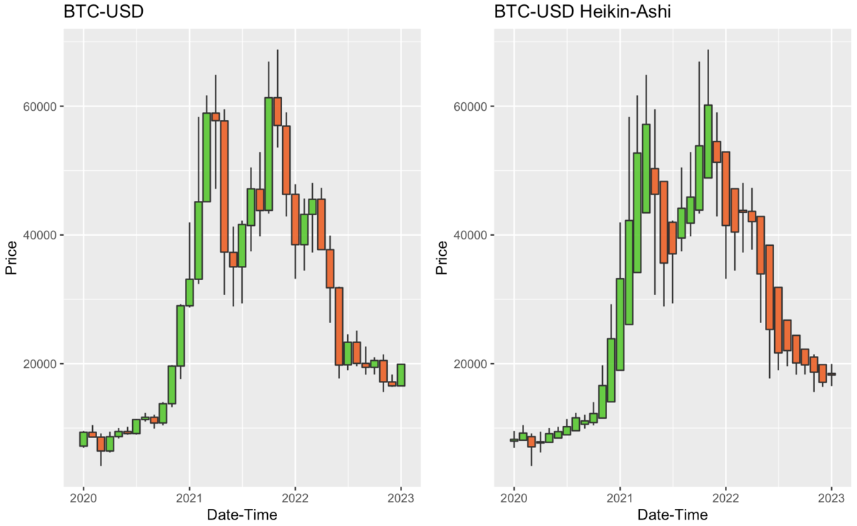
通常のローソク足だと、上がったり下がったりがノイズ的に見えてますが、 平均足だと、2021年末以降ずっと下落トレンドですね。
一目瞭然ですね!!
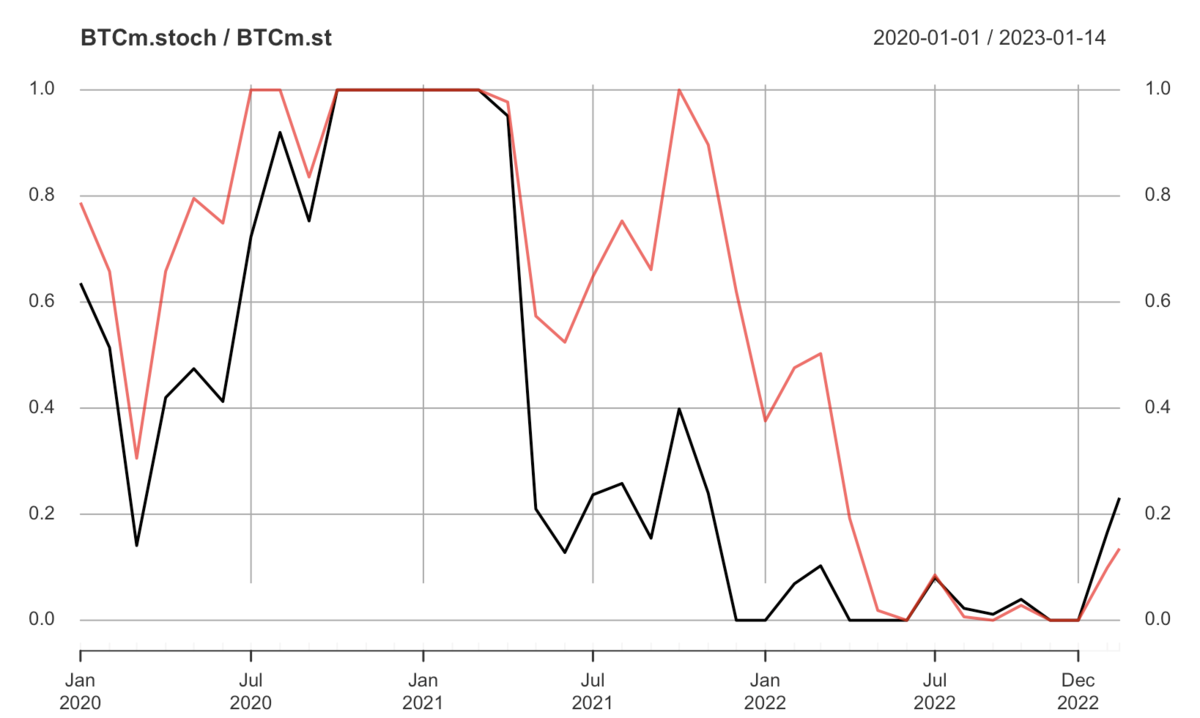
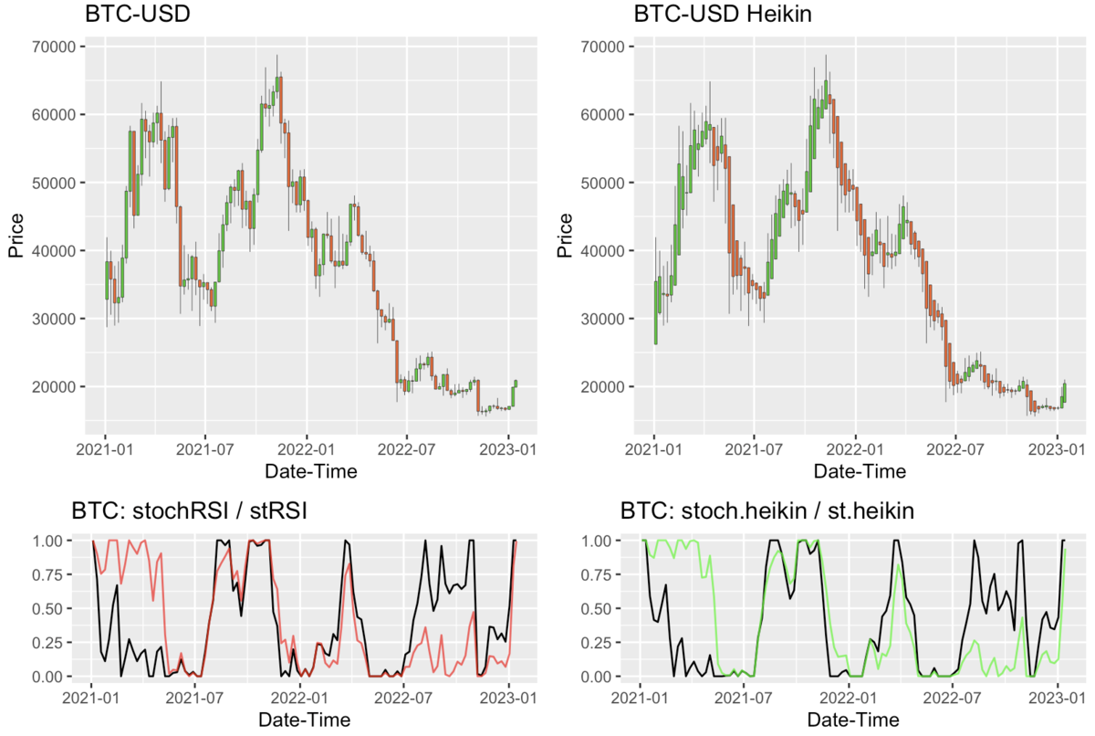
月足データのストキャスティクスRSIオシレーター
続いて、ストキャスティクスRSIオシレーター(以下、StochRSI)を計算します。
StochRSIは、通常のRSI(Relative Strength Index、相対力指数)がN日間の期間中、相対的にどの水準を推移しているかを示す指標です。通常のRSIよりも、ある期間中の変動幅(高値・安値)に対する値位置をより明確に見極められます。
また、今回自作したstRSI関数は、StochRSIをより鋭敏にした関数です。
#月足データのRSI
BTCm.stoch <- stochRSI(BTCm)
BTCm.st <- stRSI(BTCm)

#プロット
a <- with(BTCm.stoch,
          stochRSI[index(BTCm.stoch) >= "2020-01-01"])
plot(a, main="BTCm.stoch / BTCm.st", ylim=c(-0.01,1.01))
lines(BTCm.st, col=alpha("red", 0.7), lwd=2)
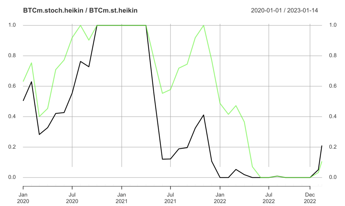
#月足の平均足データのRSI
BTCm.stoch.heikin <- stochRSI(heikin_ashi(BTCm))
BTCm.st.heikin <- stRSI(heikin_ashi(BTCm))

#プロット
a <- with(BTCm.stoch.heikin,
          stochRSI[index(BTCm.stoch.heikin) >= "2020-01-01"])
plot(a,
     main="BTCm.stoch.heikin / BTCm.st.heikin",
     ylim=c(-0.01,1.01))
lines(BTCm.st.heikin, col=alpha("green", 0.7), lwd=2)
次には、キャンドルチャートと両方併せて、プロットしてみます。
#月足のローソクチャート
p <- ggChandles(BTCm,
                term=c("2020-01-01", "2023-12-31"),
                TsukiAshi=TRUE)

#stochRSI、stRSIのプロット
BTCm.s <- cbind(BTCm.stoch, BTCm.st)
p2 <- ggChart(x=BTCm.s, y="stochRSI",
              term=c("2020-01-01", "2023-12-31"),
              Tittle="BTC: stochRSI / stRSI")
p2 <- p2 + geom_line(aes(x=Index, y=stRSI),
                     colour=alpha("red", 0.7),
                     linetype="solid")

#月足のローソクチャート
p1 <- ggChandles(heikin_ashi(BTCm),
                term=c("2020-01-01", "2023-12-31"),
                TsukiAshi=TRUE,
                Tittle="BTC-USD Heikin")

#平均足のローソクチャート
BTCm.sh <- cbind(BTCm.stoch.heikin, BTCm.st.heikin)
p3 <- ggChart(x=BTCm.sh, y="stochRSI",
              term=c("2020-01-01", "2023-12-31"),
              Tittle="BTC: stoch.heikin / st.heikin")
p3 <- p3 + geom_line(aes(x=Index, y=stRSI),
                     colour=alpha("green", 0.7),
                     linetype="solid")

##複数図の作成
layout <- rbind(c(1, 1, 2, 2), c(1, 1, 2, 2), c(3, 3, 4, 4))
gridExtra::grid.arrange(p, p1, p2, p3, layout_matrix=layout)
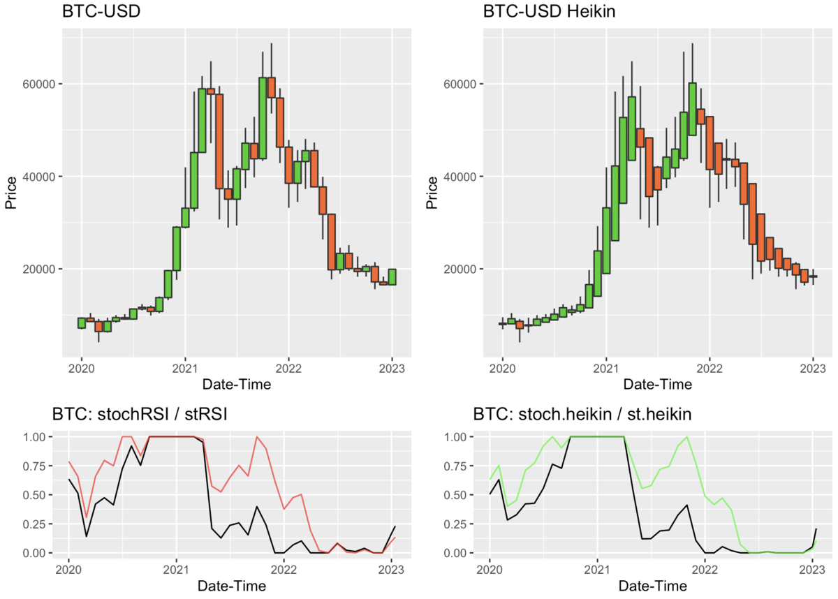
stRSIの結果から、2021年10月ごろが最後のピークだったってことがよく分かりますね。
BTCの週足データの平均足チャートを作成する
次に、BTCの週足データから、平均足チャートを作成してみます。 月足データと同じ手順で行います。
#週足データの取得:  2014年10月以降
BTCw <- getSymbols("BTC-USD",
           from = "2014-10-01",
           to = "2023-12-31",
           periodicity = 'weekly',
           src = "yahoo",
           verbose = F,
           auto.assign=FALSE)

#列名の変更
BTCw <- setNames(BTCw,
                 nm = c("Open", "High", "Low", "Close", "Volume", "Adjusted"))

#表示
head(BTCw)
#              Open    High     Low   Close    Volume Adjusted
#2014-09-29 387.427 391.379 289.296 320.510 209452896  320.510
#2014-10-06 320.389 382.726 302.560 378.549 341152804  378.549
#2014-10-13 377.921 411.698 368.897 389.546 156902070  389.546
#2014-10-20 389.231 392.646 342.877 354.704 113691800  354.704
#2014-10-27 354.777 359.984 320.626 325.892 107075700  325.892
#2014-11-03 325.569 363.626 325.077 363.264 116793470  363.264

#ggChandlesによるキャンドルチャート
p1 <- ggChandles(x=BTCw,
                 term=c("2021-06-01", "2023-12-31"),
                 lwd=0.15)

#平均足のキャンドルチャート
p2 <- ggChandles(heikin_ashi(BTCw),
                 term=c("2021-06-01", "2023-12-31"),
                 Tittle="BTC-USD Heikin-Ashi",
                 lwd=0.15)

#複数図のプロット
gridExtra::grid.arrange(p1, p2, nrow = 1)
2022年初め以降の傾向だと、週足データでの上昇トレンドは、続いて4週間というのが良いとこかも。
続いて、stRSIの結果も一緒にプロットしてみます。
#週足のローソクチャート
p <- ggChandles(BTCw,
                term=c("2021-01-01", "2023-12-31"),
                lwd=0.15)

#週足データのRSI
BTCw.stoch <- stochRSI(BTCw)
BTCw.st <- stRSI(BTCw)

#stochRSI、stRSIのプロット
BTCw.s <- cbind(BTCw.stoch, BTCw.st)
p2 <- ggChart(x=BTCw.s, y="stochRSI",
              term=c("2021-01-01", "2023-12-01"),
              Tittle="BTC: stochRSI / stRSI")
p2 <- p2 + geom_line(aes(x=Index, y=stRSI),
                     colour=alpha("red", 0.7),
                     linetype="solid")

#週足のローソクチャート
p1 <- ggChandles(heikin_ashi(BTCw),
                term=c("2021-01-01", "2023-12-01"),
                Tittle="BTC-USD Heikin",
                lwd=0.15)

#週足の平均足データ
BTCw.stoch.heikin <- stochRSI(heikin_ashi(BTCw))
BTCw.st.heikin <- stRSI(heikin_ashi(BTCw))

#平均足のローソクチャート
BTCw.sh <- cbind(BTCw.stoch.heikin, BTCw.st.heikin)
p3 <- ggChart(x=BTCw.sh, y="stochRSI",
              term=c("2021-01-01", "2023-12-01"),
              Tittle="BTC: stoch.heikin / st.heikin")
p3 <- p3 + geom_line(aes(x=Index, y=stRSI),
                     colour=alpha("green", 0.7),
                     linetype="solid")

##複数図の作成
layout <- rbind(c(1, 1, 2, 2), c(1, 1, 2, 2), c(3, 3, 4, 4))
gridExtra::grid.arrange(p, p1, p2, p3, layout_matrix=layout)
週足のstRSIの結果から、局所的な高値がより分かり易くなったように見えますね。
BTCの日足データの平均足チャートを作成する
今回、stRSIの期間を、14、25、50、75日に設定して計算して、下図としてプロットしてみます。 過去180日間の日足データを用います。
#日足の取得 + 列名変更: 過去180日間
BTCd <- getSymbols("BTC-USD",
           from = lubridate::today()-lubridate::ddays(180),
           to = lubridate::today(),
           periodicity = 'daily',
           src = "yahoo",
           verbose = F,
           auto.assign=FALSE)  %>%
  setNames(nm = c("Open", "High", "Low", "Close", "Volume", "Adjusted"))

#表示
head(BTCd)
#               Open     High      Low    Close      Volume Adjusted
#2022-07-18 20781.91 22633.03 20781.91 22485.69 39974475562 22485.69
#2022-07-19 22467.85 23666.96 21683.41 23389.43 48765202697 23389.43
#2022-07-20 23393.19 24196.82 23009.95 23231.73 42932549127 23231.73
#2022-07-21 23233.20 23388.32 22431.15 23164.63 33631012204 23164.63
#2022-07-22 23163.75 23671.93 22603.42 22714.98 31421555646 22714.98
#2022-07-23 22706.98 22977.21 22002.91 22465.48 24021799169 22465.48

#日足のローソクチャート
p <- ggChandles(BTCd,
                term=c("2022-10-01", "2023-12-31"),
                lwd=0.15)

#日足データのstRSI
BTCd.st14 <- stRSI(BTCd, n = 14)
BTCd.st25 <- stRSI(BTCd, n = 25)
BTCd.st50 <- stRSI(BTCd, n = 50)
BTCd.st75 <- stRSI(BTCd, n = 75)

#列の結合と列名の変更
BTCd.s <- cbind(BTCd.st14, BTCd.st25, BTCd.st50, BTCd.st75) %>%
  setNames(nm = c("stRSI14", "stRSI25", "stRSI50", "stRSI75"))

#stochRSI、stRSIのプロット
p2 <- ggChart(x=BTCd.s, y="stRSI14",
              term=c("2022-10-01", "2023-12-31"),
              Tittle="BTC: stRSI") +
  geom_line(aes(x=Index, y=stRSI25),
            colour=alpha("red", 0.7),
            linetype="solid") +
  geom_line(aes(x=Index, y=stRSI50),
            colour=alpha("blue", 0.7),
            linetype="solid") +
  geom_line(aes(x=Index, y=stRSI75),
            colour=alpha("green", 0.7),
            linetype="solid")

#日足のローソクチャート
p1 <- ggChandles(heikin_ashi(BTCd),
                term=c("2022-10-01", "2023-12-31"),
                Tittle="BTC-USD Heikin",
                lwd=0.15)

#日足の平均足データ
BTCd.st14.heikin <- stRSI(heikin_ashi(BTCd), n = 14)
BTCd.st25.heikin <- stRSI(heikin_ashi(BTCd), n = 25)
BTCd.st50.heikin <- stRSI(heikin_ashi(BTCd), n = 50)
BTCd.st75.heikin <- stRSI(heikin_ashi(BTCd), n = 75)

#列の結合と列名の変更
BTCd.sh <- cbind(BTCd.st14.heikin, BTCd.st25.heikin,
                 BTCd.st50.heikin, BTCd.st75.heikin) %>%
  setNames(nm = c("stRSI14", "stRSI25", "stRSI50", "stRSI75"))

#平均足のローソクチャート
p3 <- ggChart(x=BTCd.sh, y="stRSI14",
              term=c("2022-10-01", "2023-12-31"),
              Tittle="BTC: stoch.heikin / st.heikin") +
  geom_line(aes(x=Index, y=stRSI25),
            colour=alpha("red", 0.7),
            linetype="solid") +
  geom_line(aes(x=Index, y=stRSI50),
            colour=alpha("blue", 0.7),
            linetype="solid") +
  geom_line(aes(x=Index, y=stRSI75),
            colour=alpha("green", 0.7),
            linetype="solid")

##複数図の作成
layout <- rbind(c(1, 1, 2, 2), c(1, 1, 2, 2), c(3, 3, 4, 4))
gridExtra::grid.arrange(p, p1, p2, p3, layout_matrix=layout)
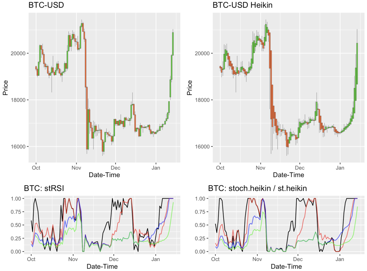
このstRSIの結果では、もう一杯一杯の上昇をしているのだが、さぁ、どうなるのでしょうかね。
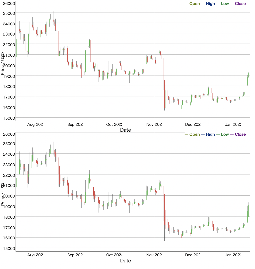
dygraphsで複数のローソクチャートを描く
最後に、dygraphsで、複数のローソクチャートを描く方法を紹介します。プロット結果をリストでまとめて、htmltools::browsableとhtmltools::tagListを使用します。
#CSS設定
css <- "
.dygraph-title {
background-color: white;
color:black;
text-align: left;
margin-left: 10%;
}
.dygraph-ylabel {
text-align:center; font-size: 15px;
margin-left: 0px;
margin-top: -5px;
}"

#書き出し
write(css, "dygraph.css")

#日足データのdygraphプロット
a <- dygraph(BTCd[,c("Open", "High", "Low", "Close")]) %>%
 dyCandlestick() %>%
 dyAxis("y", label = "Price / USD", labelWidth=20) %>%
 dyAxis("x", label = "Date", rangePad=5, labelHeight=20) %>%
 dyCSS("dygraph.css")

#平均足データのdygraph
b <- dygraph(heikin_ashi(BTCd)) %>%
 dyCandlestick() %>%
 dyAxis("y", label = "Price / USD", labelWidth=20) %>%
 dyAxis("x", label = "Date", rangePad=5, labelHeight=20) %>%
 dyCSS("dygraph.css")

#リスト作成
plotobj <- list(a, b)

#レンダー
htmltools::browsable(htmltools::tagList(plotobj))
まとめ
平均足のローソクチャート、RSIは、まだまだ奥が深いですね。
補足
月足データにケルトナー・チャンネルを重ねてみると、、
Keltner Channels (ケルトナー・チャンネル)は、移動平均の上下に設定されたボラティリティ・ベースの包括的な指標です。
この指標は、ボリンジャーバンドに似ていますが、ケルトナー チャネルは、チャネル距離を設定するために、ATR(Average True Range)を使用しています。
#21月のKeltner Channels
kc <- keltnerChannels(BTCm[,c("High", "Low", "Close")],
                      n = 21)

##Keltner Channels列の結合
BTCm.kc <- cbind(BTCm, kc)

#列名の変更
colnames(BTCm.kc) <- c("Open", "High", "Low", "Close",
                       "Volume", "Adjusted",
                       "dn", "mavg", "up")

#キャンドルチャート作図
p <- ggChandles(BTCm.kc,
                term=c("2020-01-01", "2023-12-31"),
                TsukiAshi=TRUE)

#Keltner Channelsの作図
p <- p + geom_line(aes(x=Index, y=dn),
                   colour="blue", linetype="dashed")
p <- p + geom_line(aes(x=Index, y=up),
                   colour="red", linetype="dashed")
p <- p + geom_line(aes(x=Index, y=mavg),
                   colour="black", linetype="dashed")

#作図
p

ほぼ願望を込めて、、下限線は12000ドル当たりで引いています。悪しからず。。